Empowering Innovators
Creating a collaboration platform for wireless engineers developing new Bluetooth technologies.

Overview
The Bluetooth SIG is a member-based, global standards organization that creates and manages Bluetooth technical specifications, which are used by tens of thousands of companies to create billions of interoperable wireless products.
Contributing members, spread all across the world, use a suite of over 10 products that enable them to work remotely and communicate, collaborate, manage projects, share and review technical content, and much more as they develop new technologies and specifications.
With the growing number of aging products impacting productivity, we set out to evolve the specification development experience.
My Role
I led the research, design, and UX strategy for Bluetooth Specification Tools from June 2018 to March 2020.
Customer Insights
I led several research efforts that uncovered customer insights and identified the core opportunities and functional areas we needed to support our customer behaviors and thinking
Vision
I designed and executed a cross-functional workshop to craft a 3-5 year product vision, including stakeholders across engineering, product management, program management, and executive leadership.
Strategy and Scope
I worked with our product manager to define a parallel path strategy, in which we made some limited investments into existing tools while crafting a new experience, with my product management and program peers. I also helped set the scope of work.
Design Execution
I designed a new experience end to end, starting with sketches and progressing to wireframes, prototypes, design documentation, and finally implementation support.
Leadership
Worked directly with executive leadership and senior stakeholders to gain buy-in on vision, strategy, and work.
The Situation
Increasingly Dissatisfied Customers
Since its founding in 1998, the membership of the Bluetooth SIG has to more than 34,000 companies. The ranks of wireless engineers collaborating remotely from all over the world to create new Bluetooth features and technologies has increased continually.
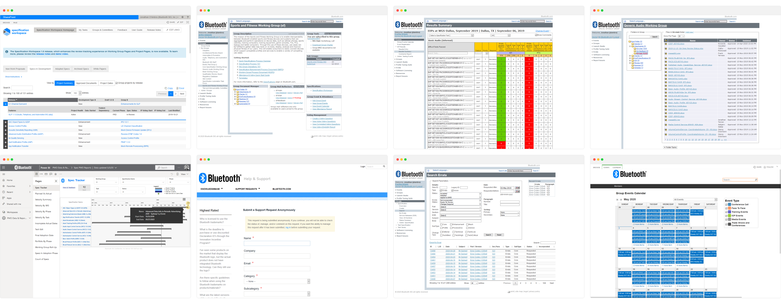
As membership increased, the Bluetooth SIG team introduced additional tools and products to support their needs. After over a decade of growth, and the increasing complexity and scope of Bluetooth specifications, the menagerie of products used by members to collaborate were no longer enough.
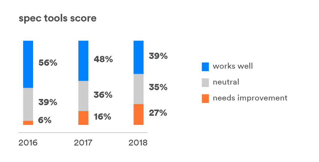
Since 2016, member dissatisfaction with specification tools rose from 6% to 27%.
In fact, 47% of active contributors noted that Spec Workspace, one of the core products used to share and review content, needed improvement. These tools were ranked last in member satisfaction.
A broad spectrum of feedback was captured in our annual customer survey:
There is not enough space to describe all the problems. Performance is horrible. The tools are missing historical documents. Tools do not yet cover the whole process.
The tools are ancient and are very confusingly organized. Working groups do not use them in a uniform manner.
I can never find any documents that I'm looking for. I rely on working group members to pass the documents through emails.
Clunky interface. Many confusing tabs. Not sure what goes where. Difficult to learn.
Needs to give summary of specifications and status to all members. It lacks metrics and it isn't easily customized for different work flow.
The Goal
Changing the Narrative
We wanted to transform this collection of tools to be an asset for members, to shift to something that truly enhanced productivity and satisfaction and made their jobs easier.
In order to address the growing issues our members faced, we were tasked with crafting a new collaboration experience for members. We sought to:
- Accelerate the pace of specification development
- Reduce the time burden on members using our products
- Improve members satisfaction with our products
- Turn a suite of 10+ tools into one unified experience
The Outcome
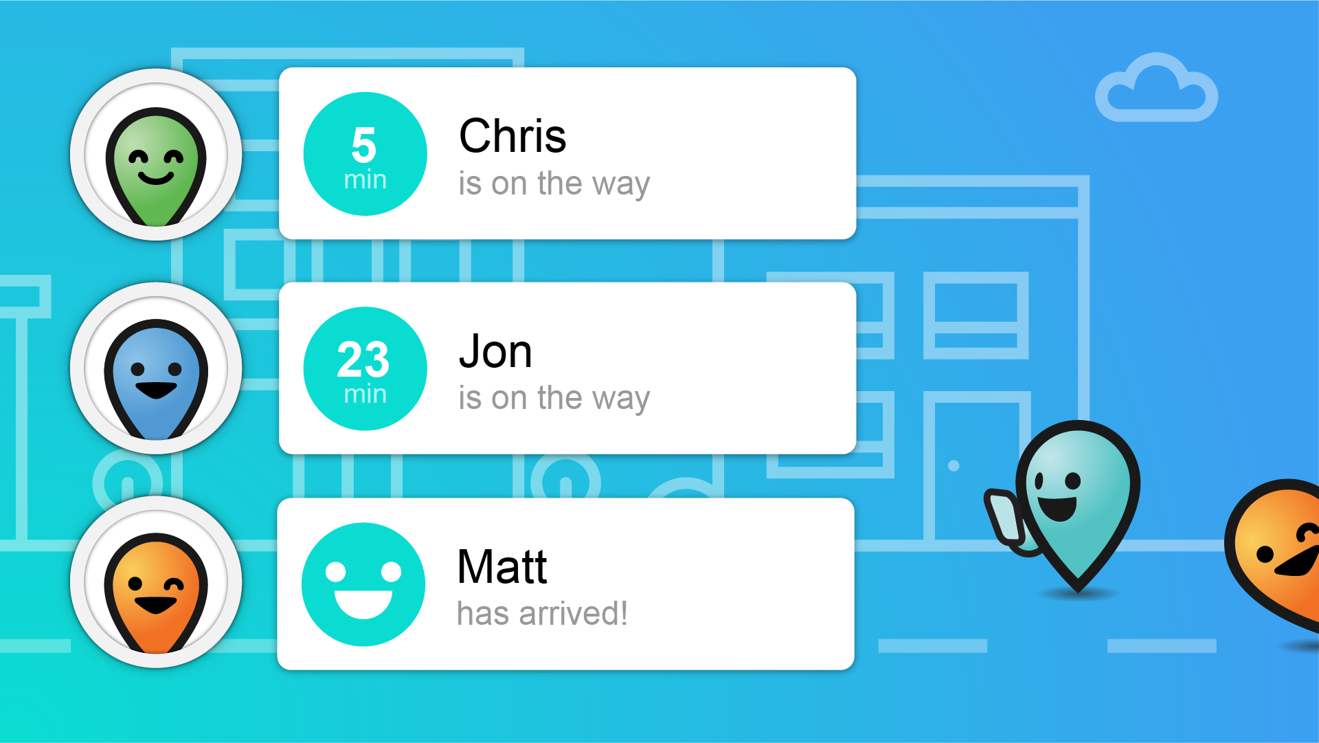
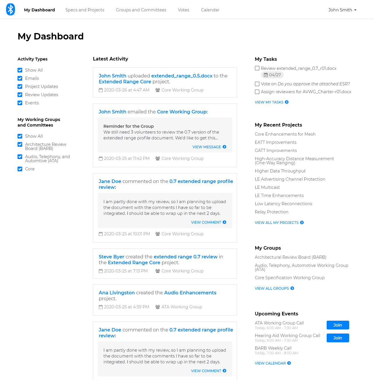
We designed a new specification collaboration experience that will be the core collaboration tool used by members to develop new Bluetooth technologies. Members will be able stay up to date on the latest activity in spec development, contribute to projects, get feedback from peers, track project milestones and progress, and much more, all in one seamless experience:
Collaboration Made Easy
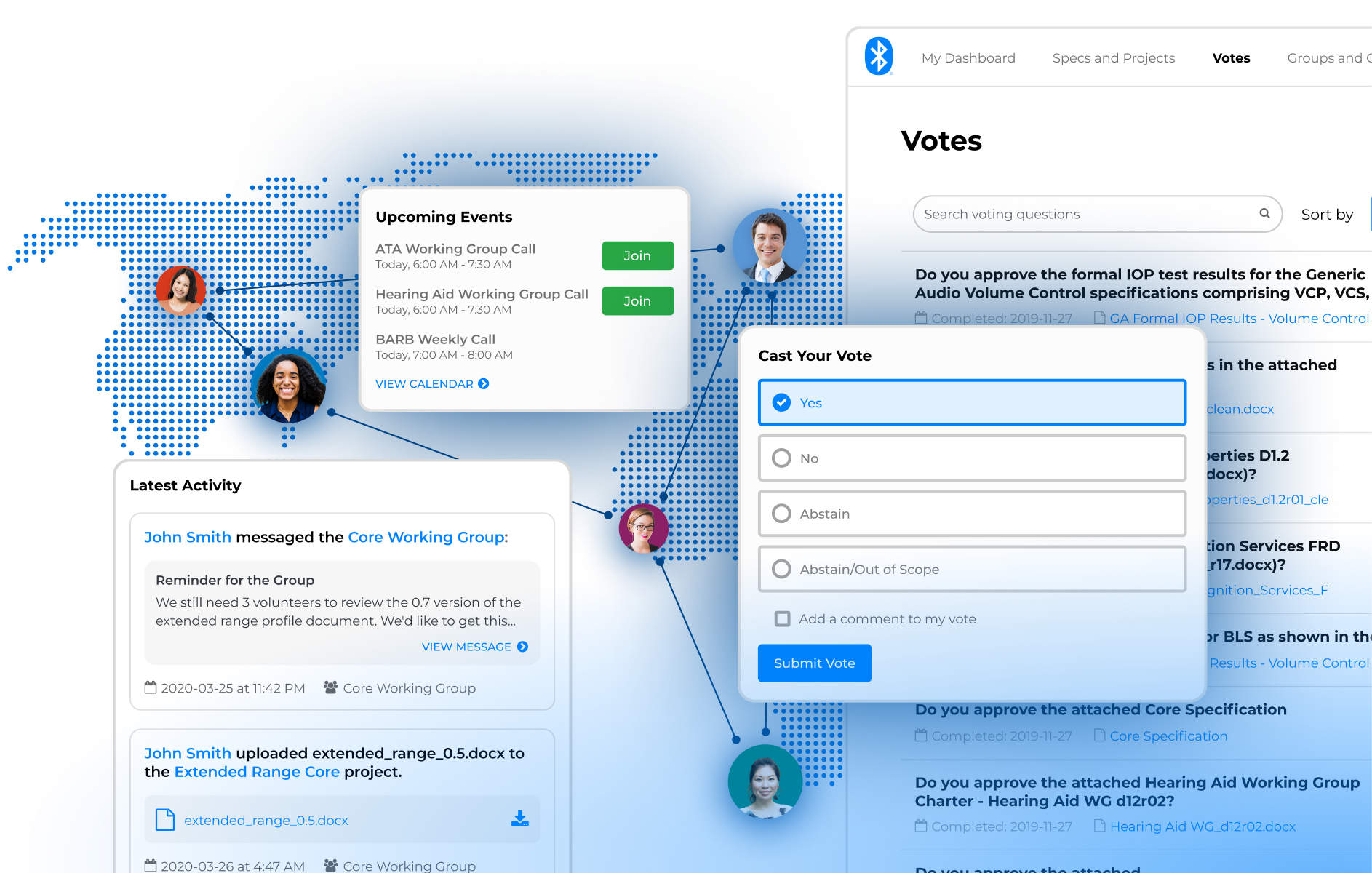
With an activity feed front and center and a personalized list of to dos, projects, groups, and events, the member dashboard makes it easy to stay up to date and communicate with fellow contributors.
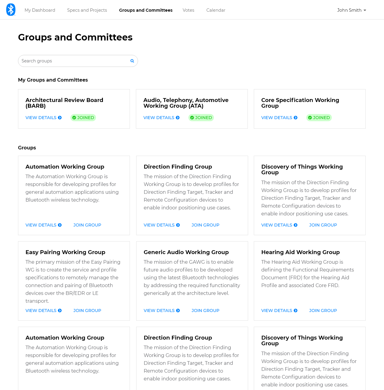
Get Involved
The groups page makes it easy for members to find, learn about, and join groups so they can start contributing. Once they've joined, they can quickly find and join active virtual collaboration meetings.
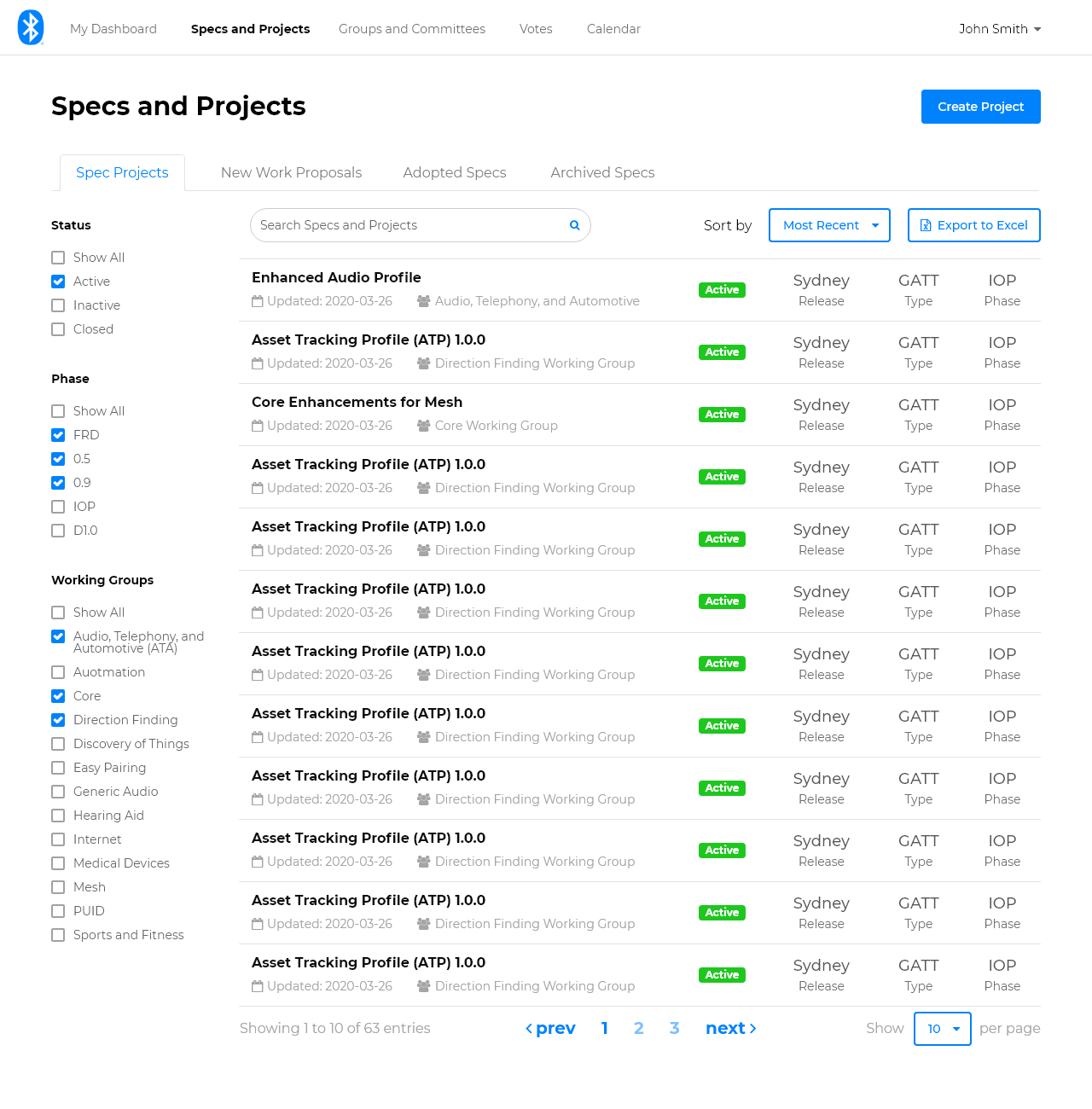
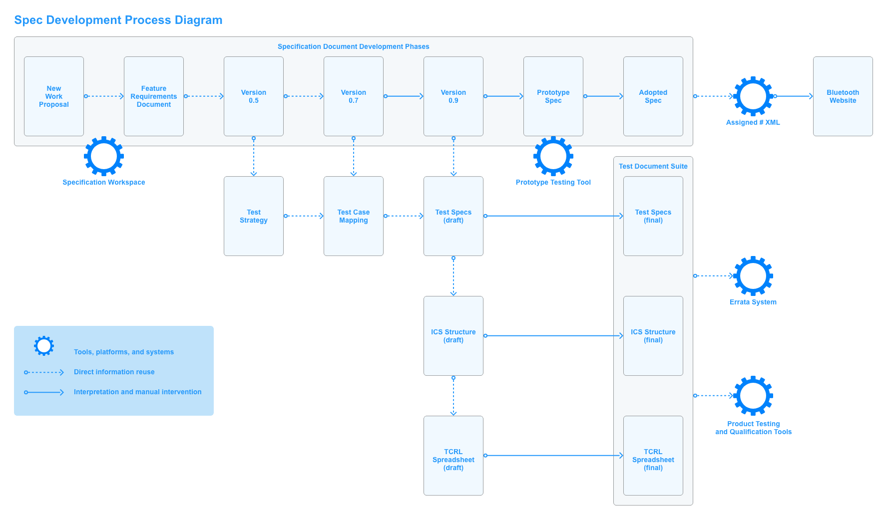
Stay on Track
Members can use the projects list and pages to keep track of specification development progress, share and review documents, flag issues, and more. Project pages walk groups and contributors step by step through the development process.
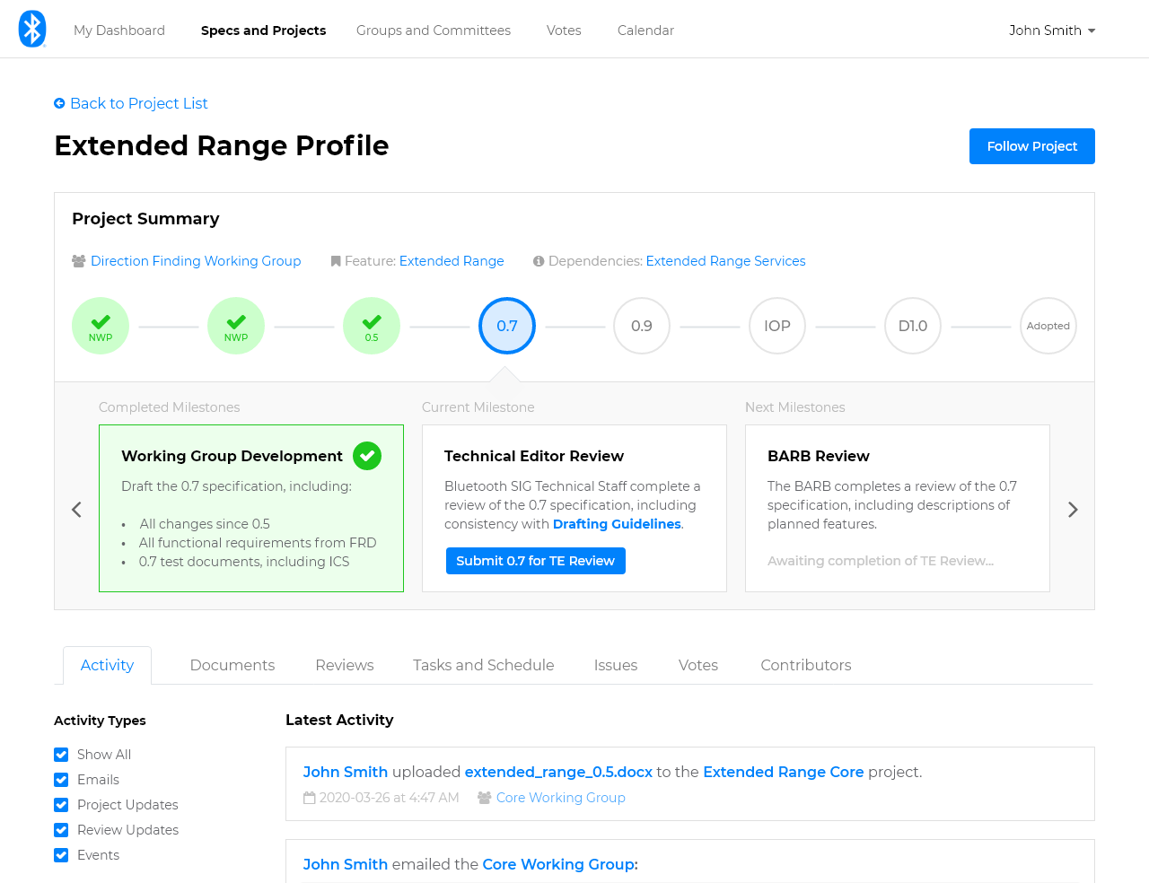
Approvals Made Easy
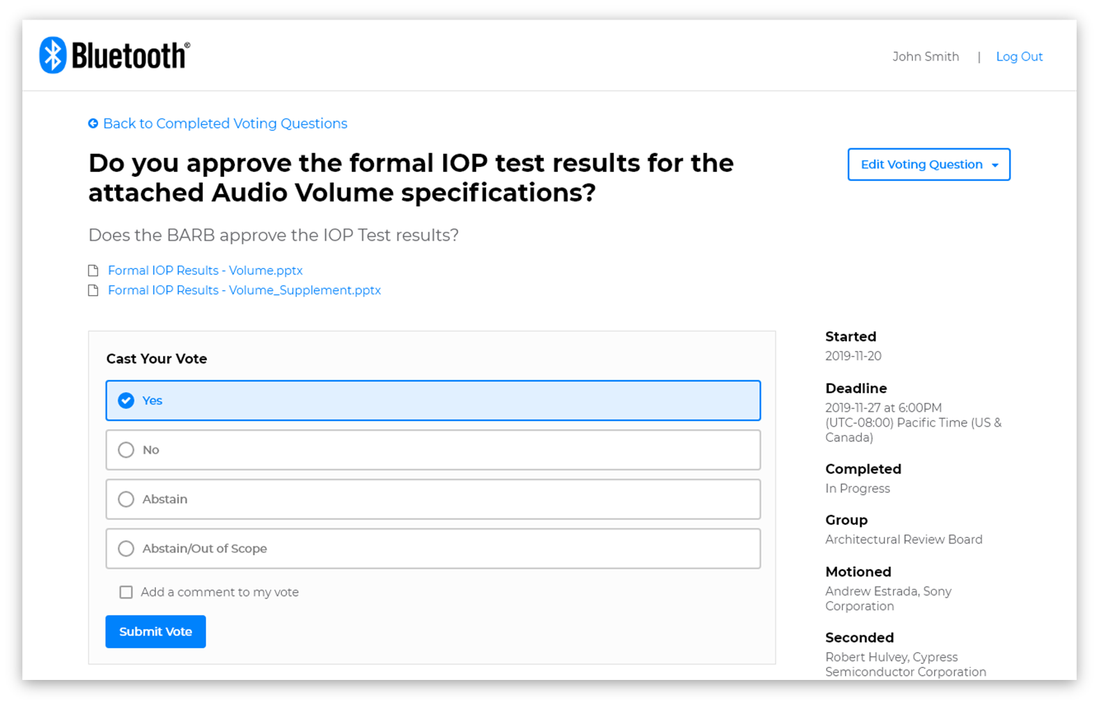
Members can vote to approve projects to move to the next phase or milestone right in the tool.
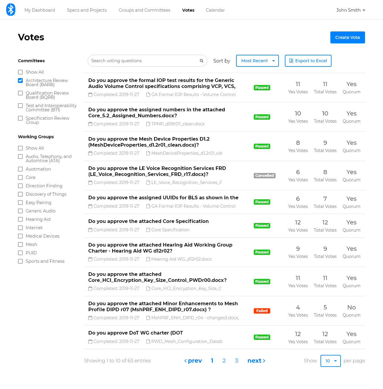
First Release Complete, With More to Come
In addition to designing the new experience, we built and released the first part of the new experience: the voting feature:
The next release, focused on enhancements to the voting and the group pages experience, is already underway.
How We Did It
Waterfall...For Now
We initially sought to build on existing platforms and release large improvements together, believing this would be our fastest and most affordable option.
While it wasn't my favorite methodology, we began with a fully waterfall approach, which required all research and design work to be completed prior development.
Then, we plotted out our strategy to get there:
- Conduct research
- Brainstorm a vision
- Design a solution
- First release
- Plan what's next
The Research
Starting in late 2018, we conducted several rounds of user research to help us set a vision for a new product experience.
Mental Model Diagram
Though I was provided with the process documentation that described the process members used to create specifications, sitting in on some early working group meetings showed me that members did a lot more behind the scenes.
To establish a clearer understanding of the problem space of specification development, I turned to researcher Indi Young, whose methods (as described in her books Mental Models and Practical Empathy) were well suited to the type of generative research I needed. Beginning with non-directed interviews with 12 users, I synthesized and crafted a Mental Model diagram that described how our participants thought, felt, and behaved when developing specifications.
To learn more about how I created this diagram, check out the case study I wrote about the process.
Not only did this diagram help the team better understand the needs, goals, and journey's our members experienced, it helped us visualize where gaps existed in how our current tools and resources supported them.
Personas
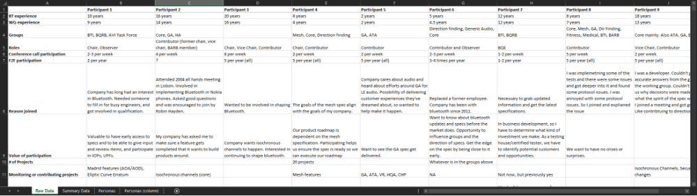
I conducted an additional 14 user interviews to collect additional qualitative data focused more specifically on member goals, behaviors, and scenarios. I worked with the team to synthesize and group the data:
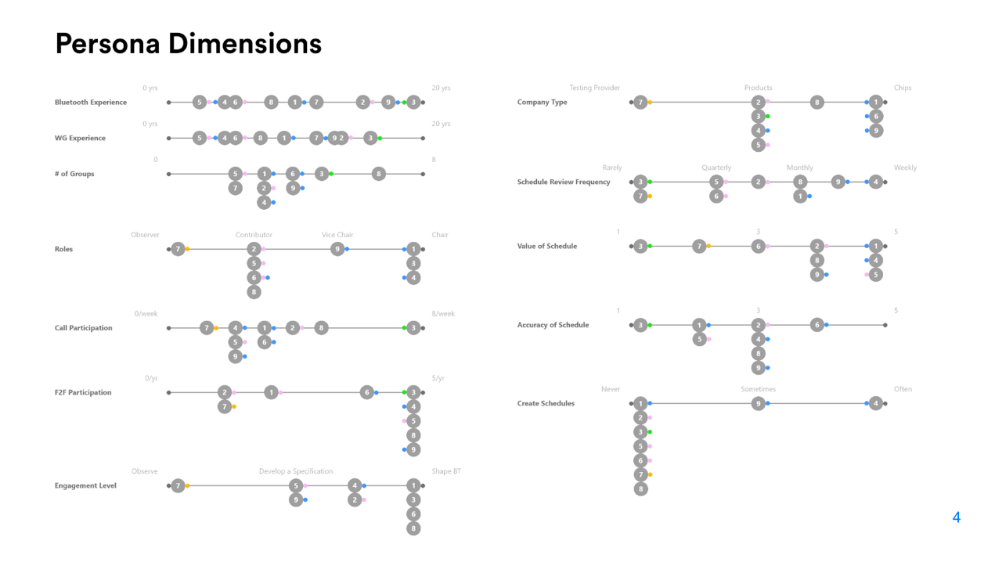
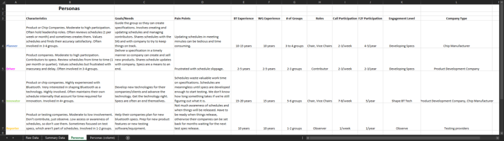
We arrived at a set of 4 user personas:
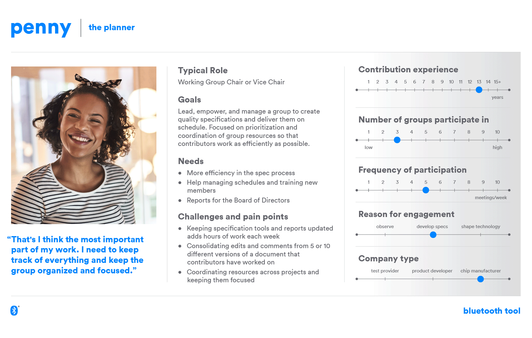
Throughout the rest of the project, we regularly leveraged the personas to craft context, goal-directed scenarios and the user feedback data and Mental Model diagram to plan and prioritize features.
Tools Feedback
Early in the project, we considered sending additional surveys to members to collect more feedback on our tools. However, we discovered a previously completed System Usability Scale (SUS) survey for some of the core functionality, including verbatim comments:
The design is very non-intuitive. Information is very hard to find. For example, once a review has been requested, the members get zero visibility on that review from the tool.
~ Anonymous SUS Survey Respondent
T=Notifications are very sparse and that results in lost productivity. if a reviewer uploads their comments and the group chair only notices them after a week since there was no notification, that's a week lost.
~ Anonymous SUS Survey Respondent
Internal group reviews are still occurring via email. If we want people other than chairs to use the tools, then we have to make it a lot more user friendly.
~ Anonymous SUS Survey Respondent
As a committee chair, I've come up to speed quickly, but there are still many times when I need to do something and it is not obvious how to do it. For those tasks that I do frequently, I've more or less memorized how to do them in the tool, but it is not obvious to others who do not have this experience, and I find I often have to walk them through the process.
~ Anonymous SUS Survey Respondent
Things break down when they go nonlinear, such as new document versions being shared before reviewers are done, missed comments, or conflicting comments from different reviewers. ~ Anonymous SUS Survey Respondent
This data gave us a starting point for some areas to investigate, so we planned and conducted a series of 7 in-person workshops with a variety of groups of members. Participants brainstormed what worked well about the tools and what didn't.
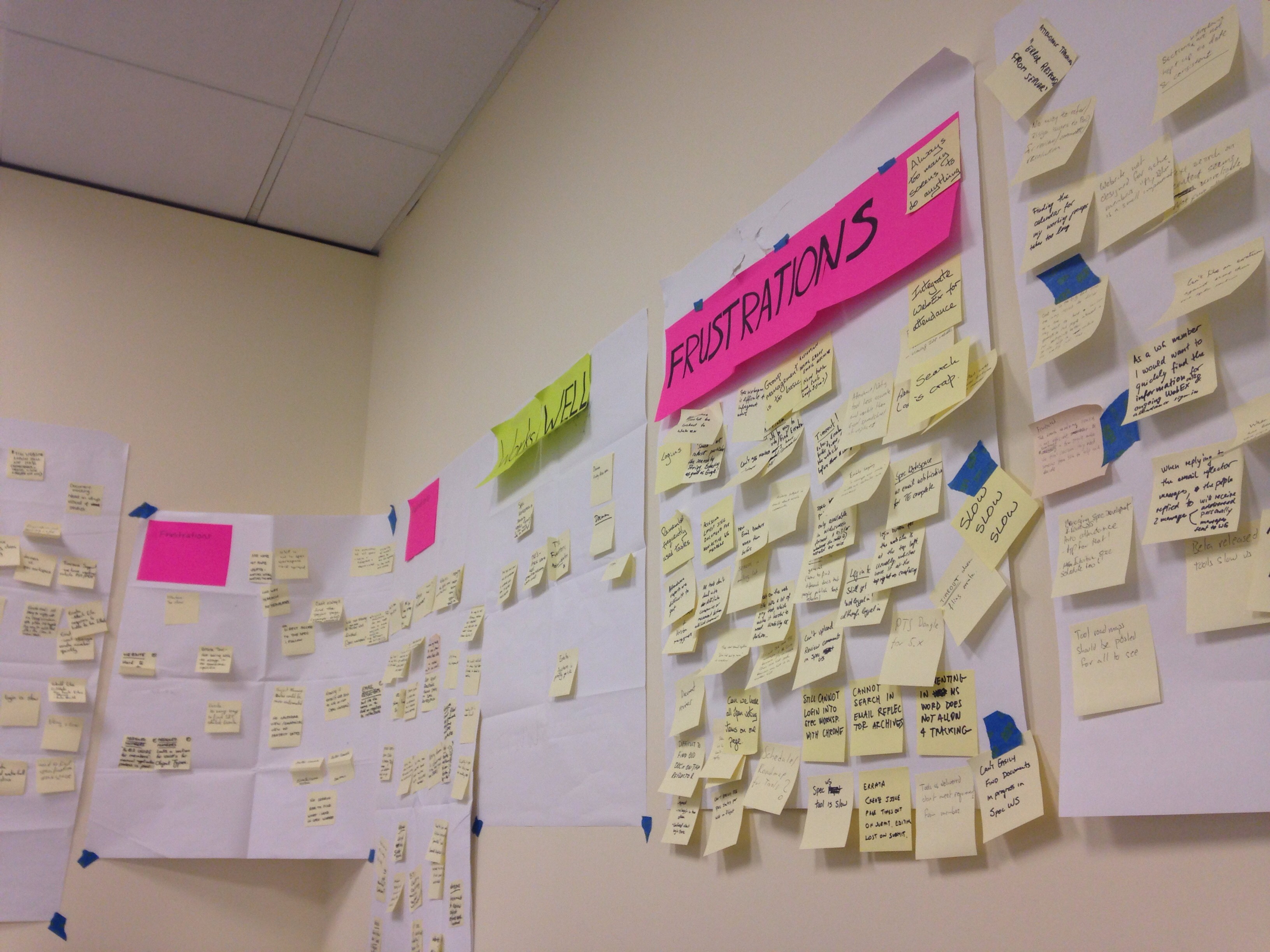
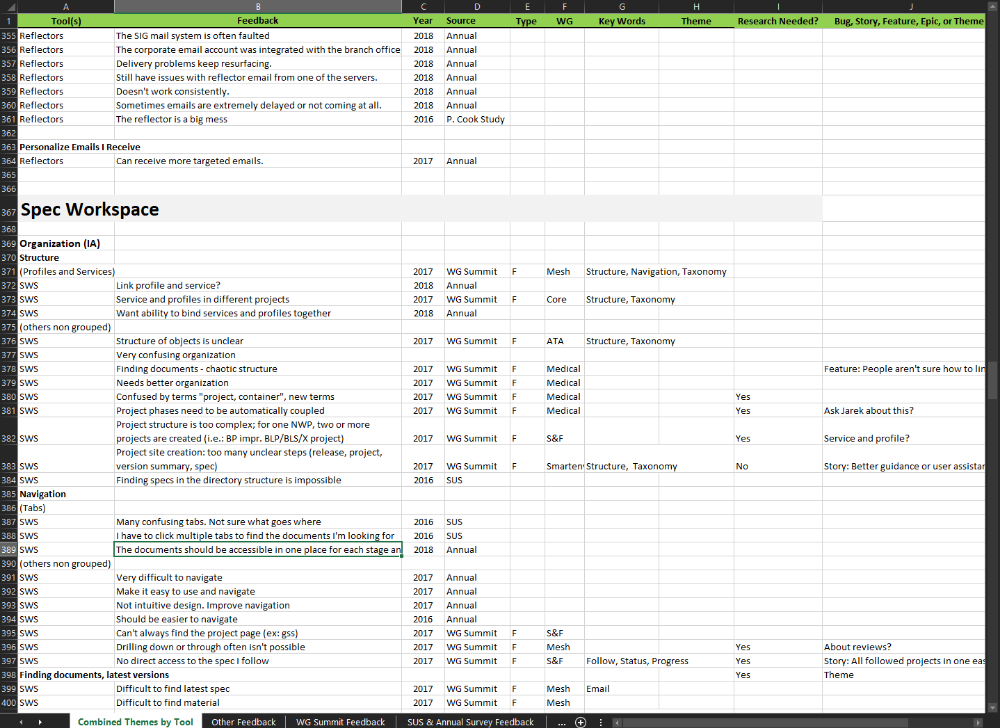
We combined this information into a spreadsheet of all user feedback we had on tools, which we added to continuously throughout the project. By grouping feedback by feature, tool, and scenario, we developed a stronger understanding of why existing features were painful for members to use.
Highlight Reel
Months into the project, we were struggling to get the resources we needed to execute on the project. To gain buy in from leadership, I decided to create a highlight reel of the challenges members faced with our products.
I conducted 5 contextual inquiry interviews with key members and asked them to show us how they used our tools on a day to day basis while we captured video of their screen and audio of their commentary. After capturing over 6 hours of footage, I cut together a 15 minute video in Adobe Premiere, organized by worfklow or feature, that illustrated the challenges our members faced in their own words.
We integrated new feedback discovered in the course of these interviews into our user feedback spreadsheet. Then, we presented the highlight reel to our key stakeholders. After the video was over, the first question asked was, "Okay, how do we get started?"
Summarized Learnings
After completing these research activities, these were our key findings:
No Visibiltiy into Collaborator Activity
Our key contributors collaborate with dozens of other members as they conceptualize, prototype, and then capture new Bluetooth features into readable specifications. Their work is often wholly dependent on others doing their part, one missing piece can stall progress for months. But knowing what everyone else is working on isn't tracked in one place, and is almost communicated through emails and phone calls.
Dozens of members may contribute to any one specifciation. Someone has to collect, organize, and facilitate the integration of those contributions. Without visibility into those activites, this process became a painful exercise of scraping emails, messages, and requesting updates on phone calls.
Fragmented Workflows and Information
Specification documents often go through dozens of revisions between multiple contributors. Editing or commenting on an old version is often wasted work. And with over a hundred specs in development, and thousands of documents in rotation, finding the work you care about is critical.
Members are typically focused on a handful of specifications, our of the hundred or more that may be in development. Our tools did nothing to show views tailored to these members.
The sheer number of tasks members complete in the products means that every second matters. Some members lost hours each week to dreaded loading times.
Knowing when a spec is likely to come out can affect the roadmaps for dozens or hundreds of planned product releases. Delays are costly and painful to absorb.
Most Members Didn't Know the Process
All but the most experienced members didn't have a firm understanding of the end to end process of specification development, which is complex. Without guidance from tools, members often completed steps out of order, resulting in rework and delays.
The Vision
Hot on the heels of our contextual inquiry highlight reel, stakeholders were eager to get started. Though we clearly understood the problems that needed to be solved, we lacked a clear direction for how to solve them.
To create a shared direction with buy in across the organization, I lead the team and stakeholders in the foot steps of Julie Zhou to create a shared North Star, a vision of what we wanted this product experience to be 3-5 years in the future.
Drawing on my facilitation training from the Nielsen Norman Group and Google's Design Sprint methodology, I planned and facilitated a Vision Workshop, leading participants through activities focused on understanding our business goals and existing user research. Next, we kicked off brainstorming, sketching exercises, dot voting, and finally, a collaborative storyboarding activity that captured our ideal experience for this future product.
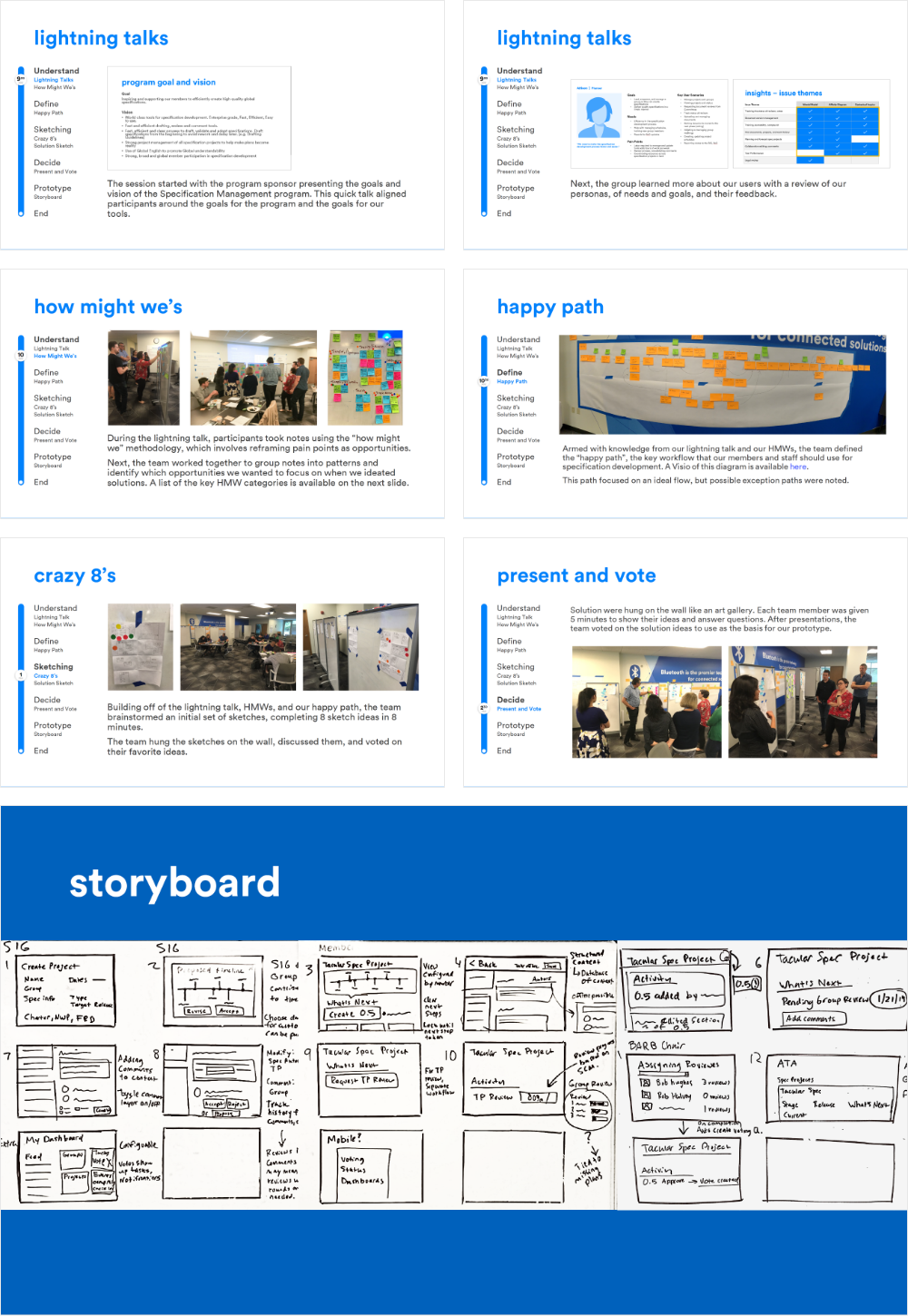
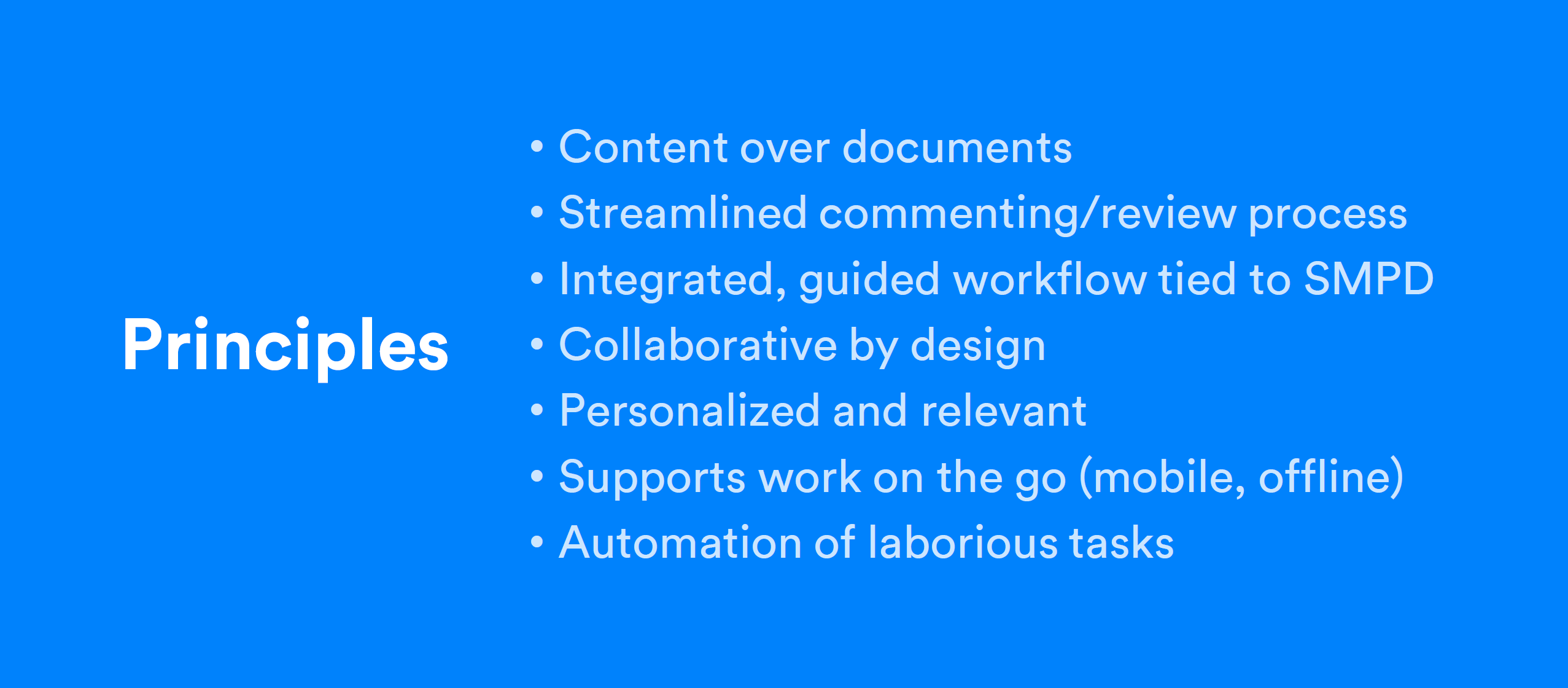
Our vision was to create a single product experience that was collaborative to the core and made all updates and changes as visible as possible, was so usable and effortless that it saved members time, and that was a product members trusted.
After the workshop, I reviewed the artifacts and pulled together a list of core principles that defined our vision. I also created a version of our storyboard we could share with our members for feedback.
Our principles were:
Here is the final vision concept I created:
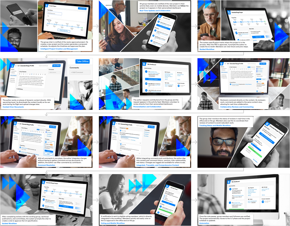
It was time for a gut check for ourselves and for our leadership: was our vision headed in the right direction?
To find out, I attended our next member event and conducted 8 concept tests. I led participants through our vision storyboard, and then asked targeted questions about their impressions, beliefs, and concerns about what they saw.
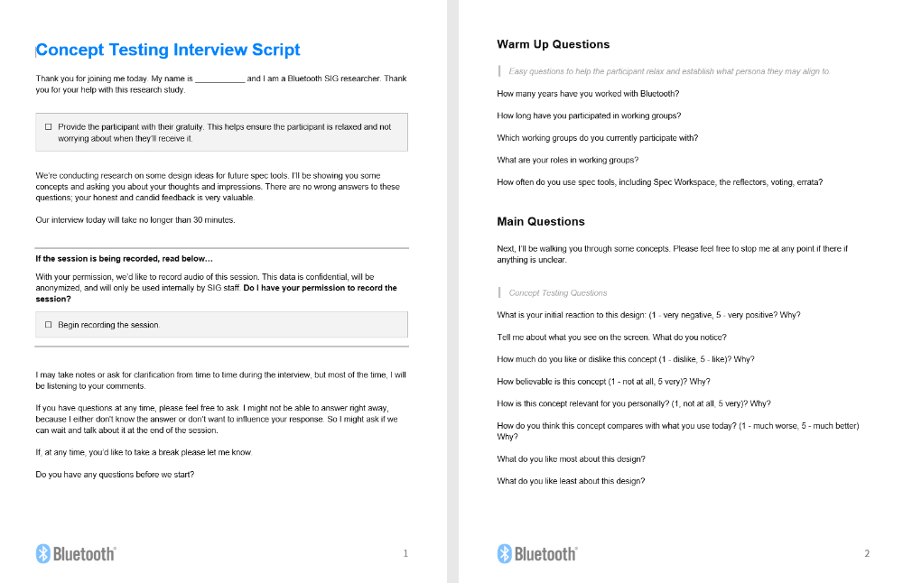
Participants graded the vision on 5 key attributes:
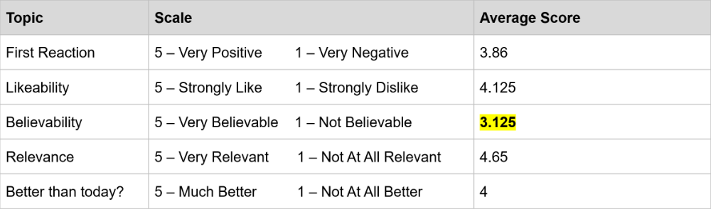
Two things became clear during our tests:
- Our vision was generally supported (sometimes enthusiastically) by the members we spoke with
- Members didn't fully trust that we could create this product in a reasonable time frame with our current resources and technology.
Given our limited resources and that we needed member time and support to design and launch this experience, we knew we needed to find ways to increase member buy-in.
Making it Real
Designing the Framework
I leaned heavily on our vision principles as we started building out our solution. Tying design decisions back to them and our vision storyboard saved a lot of time selling stakeholders our certain high-level design decisions.
These principles manifested in a few key design choices:
1. Effortless Navigation
Our existing systems had little to no contextual navigation, making finding anything difficult and moving between pages laborious. I wanted to create an interconnected and contextual experience, where members could move horizontally through the system based on context, rather than having to constantly return to top level navigation and drill back down into the details they needed.
I drew inspiration from Sophia Prater and her Object-Oriented UX method and created a map of the objects our system would include:
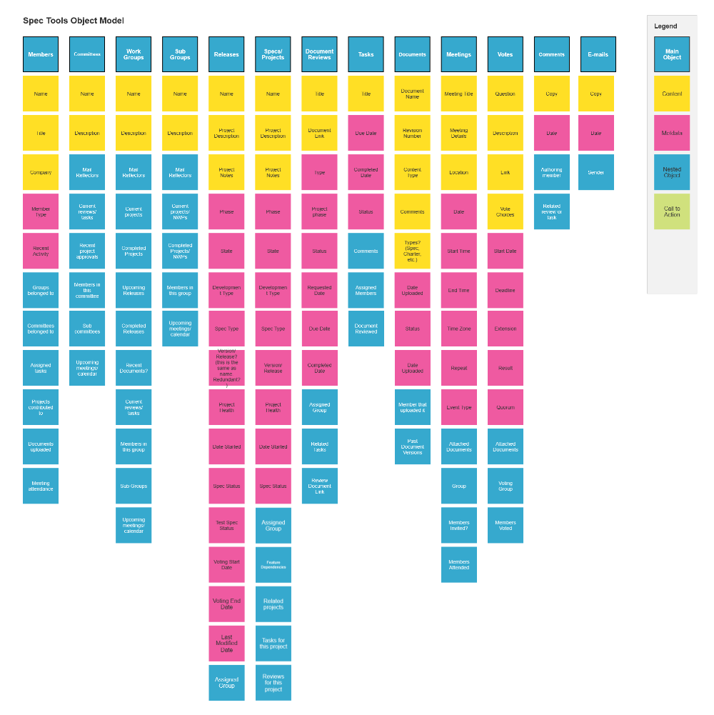
Using the object map empowered the team and I to have conceptual discussions about objects and their relationships, in-context navigation, and actions available around objects, all without sketching a single wireframe
2. Activity First
Communication is the most fundamental ways things get done in specification development, especially for teams working remotely across the globe. It can also be the most time consuming. I drew inspiration from other tools and products across industries that made sharing and finding updates easy:
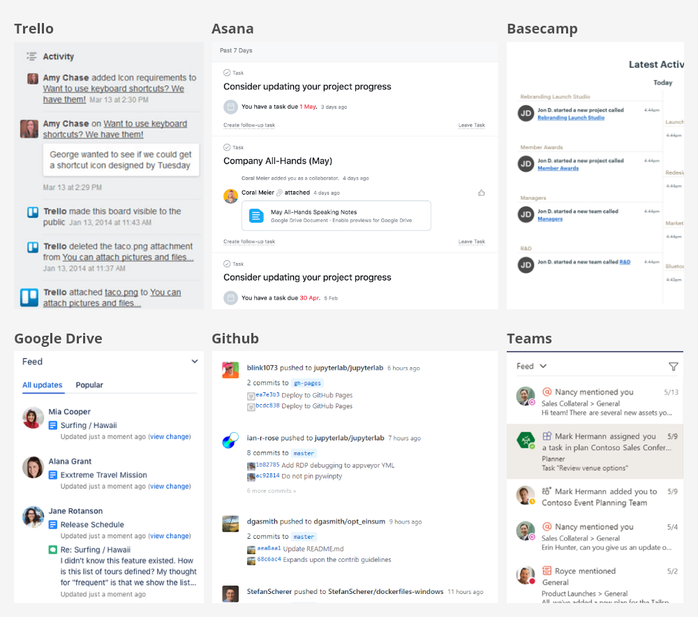
Based on our findings, the team aligned on an activity feed that would provide members with a quick way to catch up on what they had missed. The feed would be populated automatically by specific events that occurred in the system.
The next decision was what goes into the feed. We settled on:
- Emails to group aliases
- New comments on documents or projects
- New uploads
- New tasks created
- Tasks assigned to specific people
- New projects created
- Projects advanced through phases
- Events upcoming
Emails were controversial, in part because not everyone is thrilled with email being the core means of communication, but also because members often receive dozens or hundreds of emails everyday. We decided to make the activity feed filterable, so members would specify the things they want to stay up to date on. We also determined to investigate the use and integration of modern messaging and collaboration tools in future efforts.
3. Personalized
Based on the many complaints we received about navigation and how difficult and time consuming it was for members to find the documents or projects they worked on, I believed that a more personalized experience would help.
Most members are engaged in just a handful of specification development projects and working groups at any given time. Based on what projects and groups members contributed to, I defined the objects we could present to them based on what they contribute to:
- Review Tasks
- Specification Projects
- Working Groups
- Events
- Messages and Emails
This personalized view would serve as a starting point for all contributing members.
Next, we explored how we might make pages outside of the dashboards more personalized and flexible as well. We settled on a set of common filters that would allow members to tailor which projects, events, or votes they saw in any given view.
Creating Structure
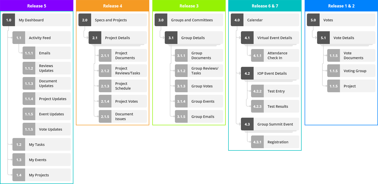
Using our object model as a foundation, I mapped out the architecture of the new experience in a sitemap.
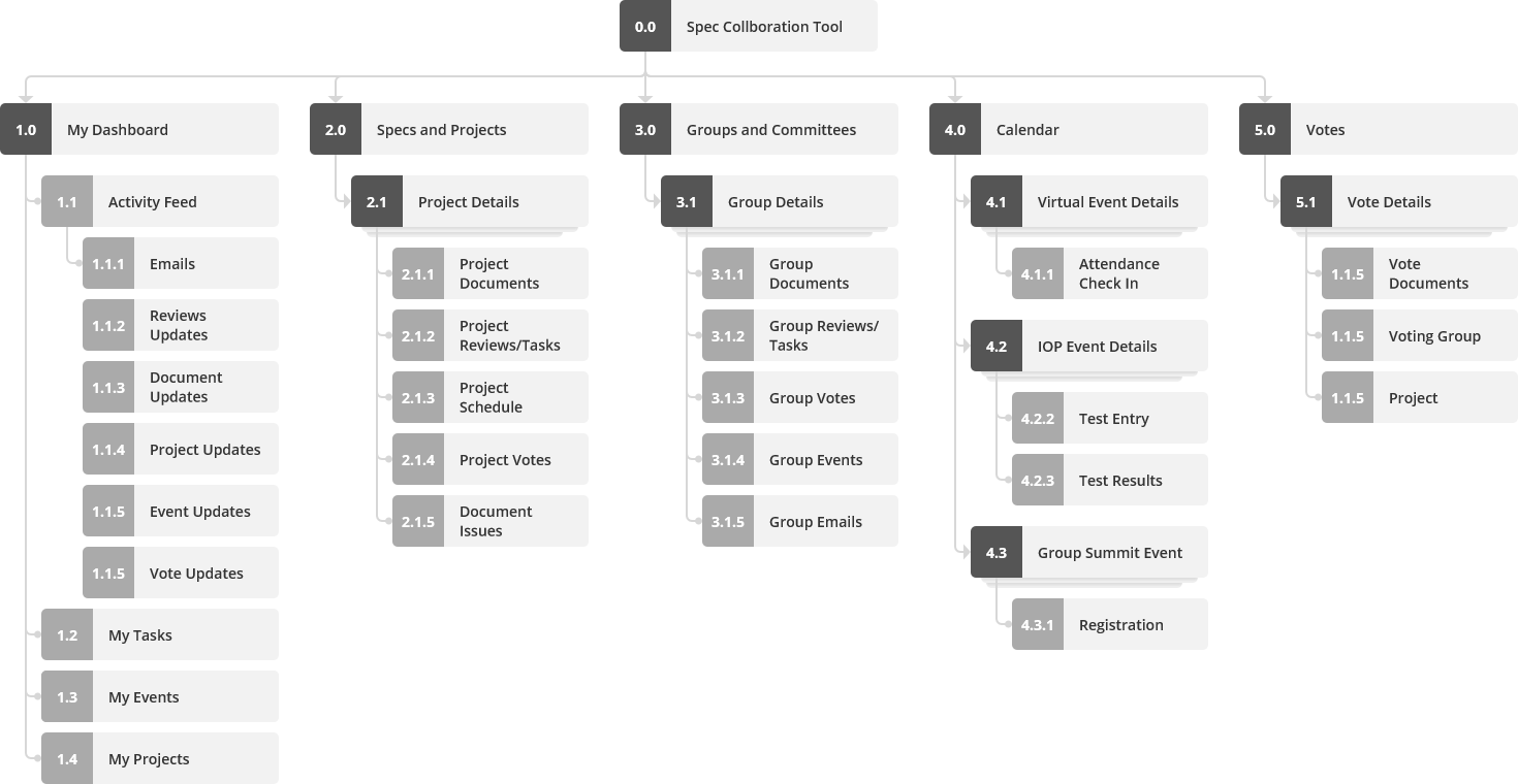
In addition to providing a framework for design, our sitemap would later help us determine how to best chunk functionality for development
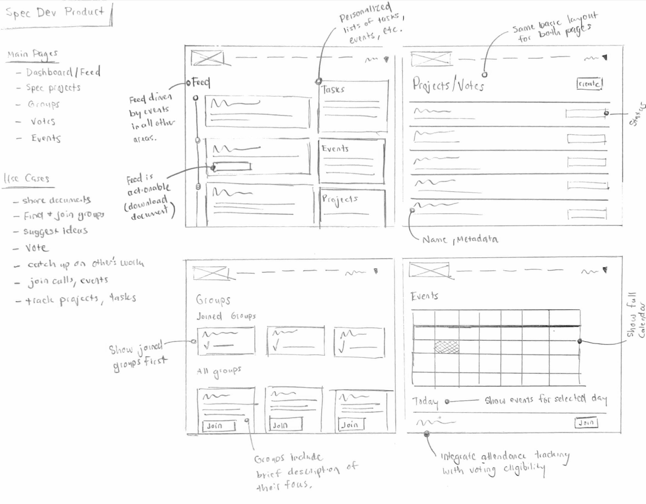
Early Concepts
Based on our design core design choices and our sitemap, I decided to frame our new experience as a high-level design concept. I sketched and built out an initial version of some of the key pages of our system:
Scope Anxiety
After a few months of planning, the size of our potential effort became clear. It would be years before we truly moved the needle using our existing technology and including the full scope of our vision. Leadership nervously eyed our efforts, supportive of our general direction, but anxiety over the cost and time nearly derailed the project.
Goodbye Waterfall, Hello Iteration
We met with our engineering team to find alternatives.
They suggested replacing smaller pieces of functionality with modern micro-services and applications that were faster and cheaper to build with. We would gradually phase the old systems out of service as a new system gradually replaced them.
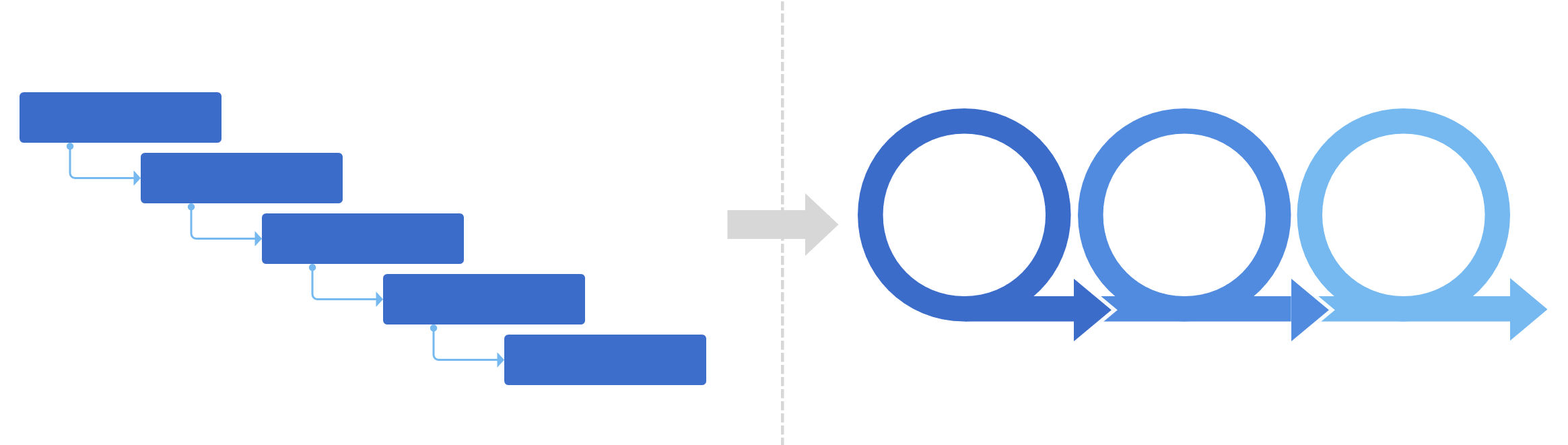
A Vertical Slice
Based on this new engineering approach, we pivoted our product and design strategy. Rather than a waterfall approach to build a whole new system, we opted to adopt an agile methodology to create a vertical slice of this new collaboration system. And for our first effort, we would focus on the workflows that best balanced low cost and high value.
Starting with Voting
We examined our design concept and mapped the core functions it included. Then, we assessed each functional area on value and cost:
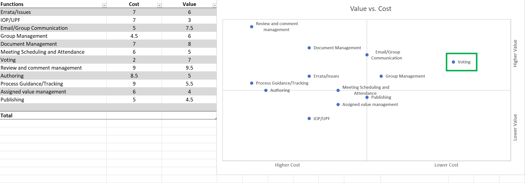
Our top priority was clear: our voting feature.
During contextual inquiries, we had noted that some of our international members experienced load times in excess of 75 seconds when trying to access our voting pages (though in our offices, the average was ~5-6 seconds). In addition, there were so many voting records from years of spec development work that the system that supported our voting features was rapidly becoming unstable.
The Design
User Scenarios
I used context scenarios, as described in Kim Goodwin's book Designing for the Digital Age, to connect myself and the team to our personas and their goals for our voting feature.
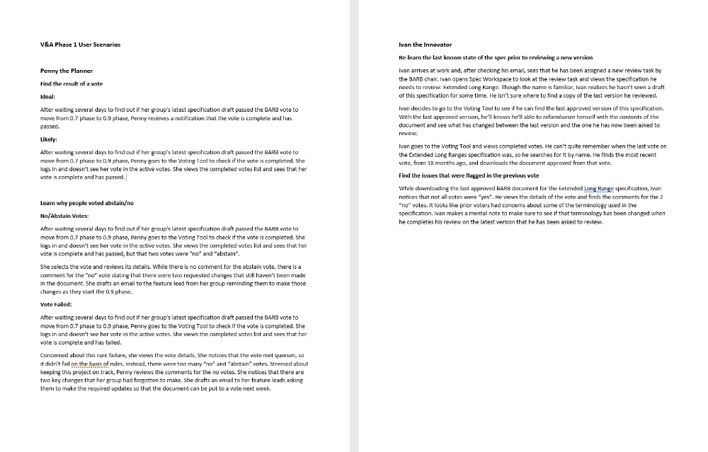
Based on our scenarios, our solution would:
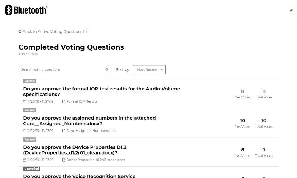
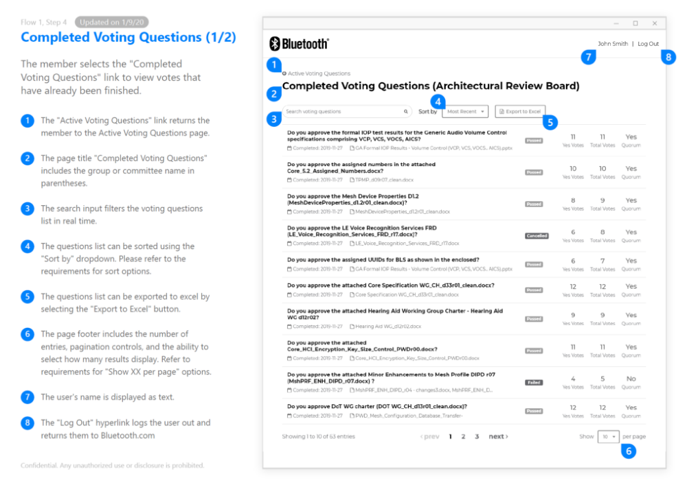
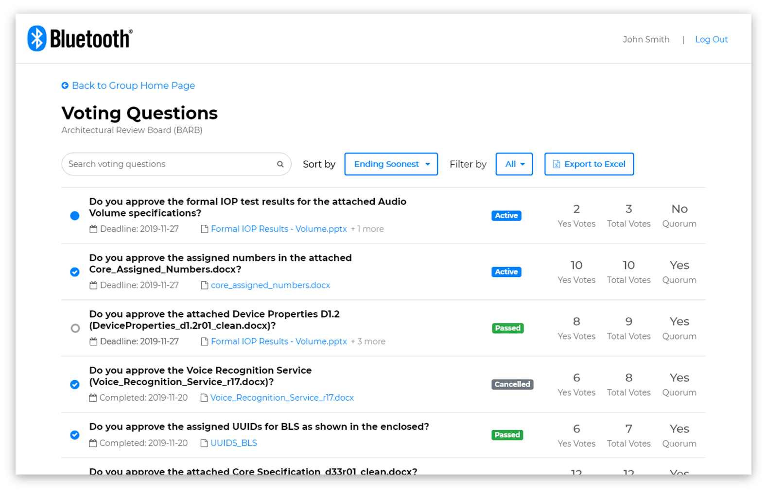
- Create a brand new experience for viewing completed voting records, a common task for members looking for approved documents or tracking the progress of specification development
- Rely on the existing system for members to place votes on active questions. This was not ideal, but it allowed us to deliver a solution much faster.
- Offer much faster performance. Between the new experiences new technology and optimization, and the massive descrease in records the existing system, we expected a large increase in performance and decrease in reported stability issues.
Prioritizing Information
One of the challenges of our current tool was poor information priority and organization. Based on our past research, we knew that the things members needed to see were often spread across different screens and places, or were arranged in the UI such that the voting result was unclear.
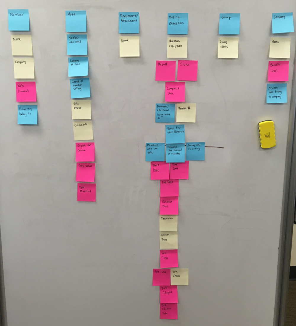
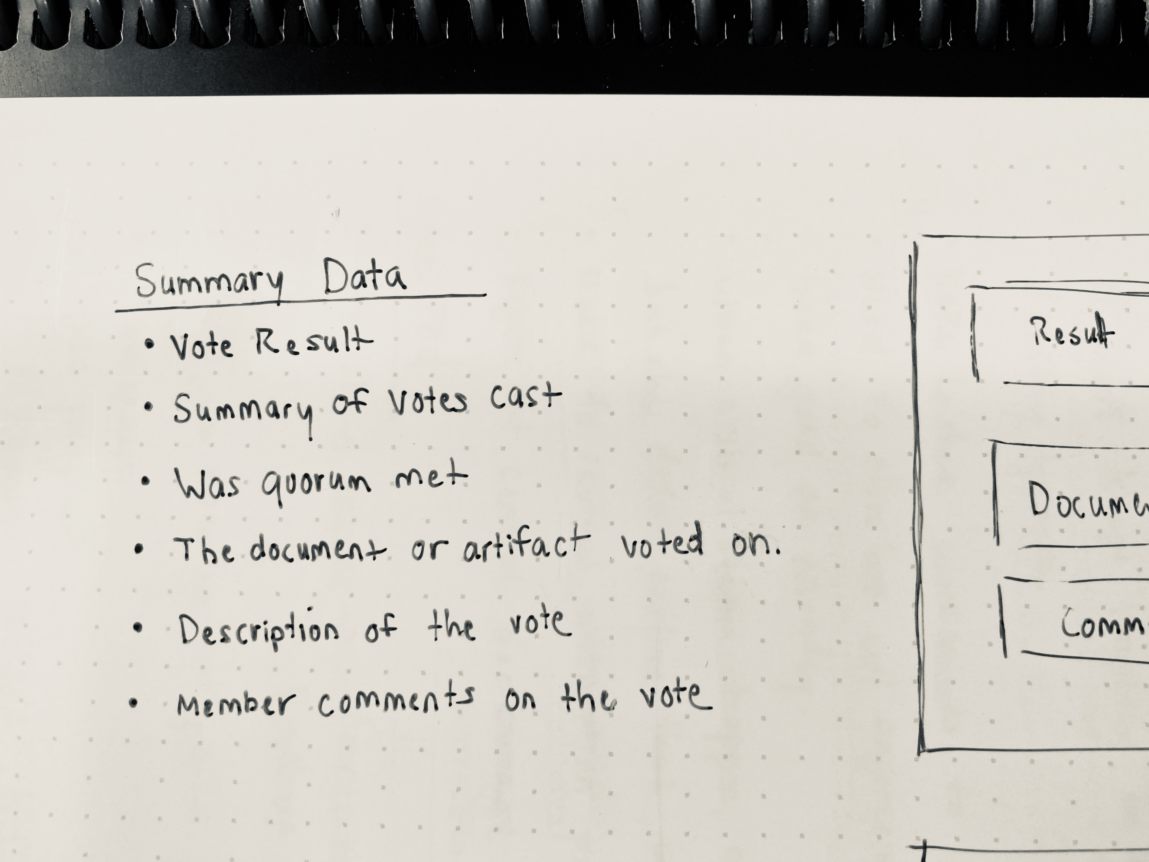
I started by listing all the objects and data elements in the system on post its, and worked with the team to prioritize and group the information by user goals and workflows.
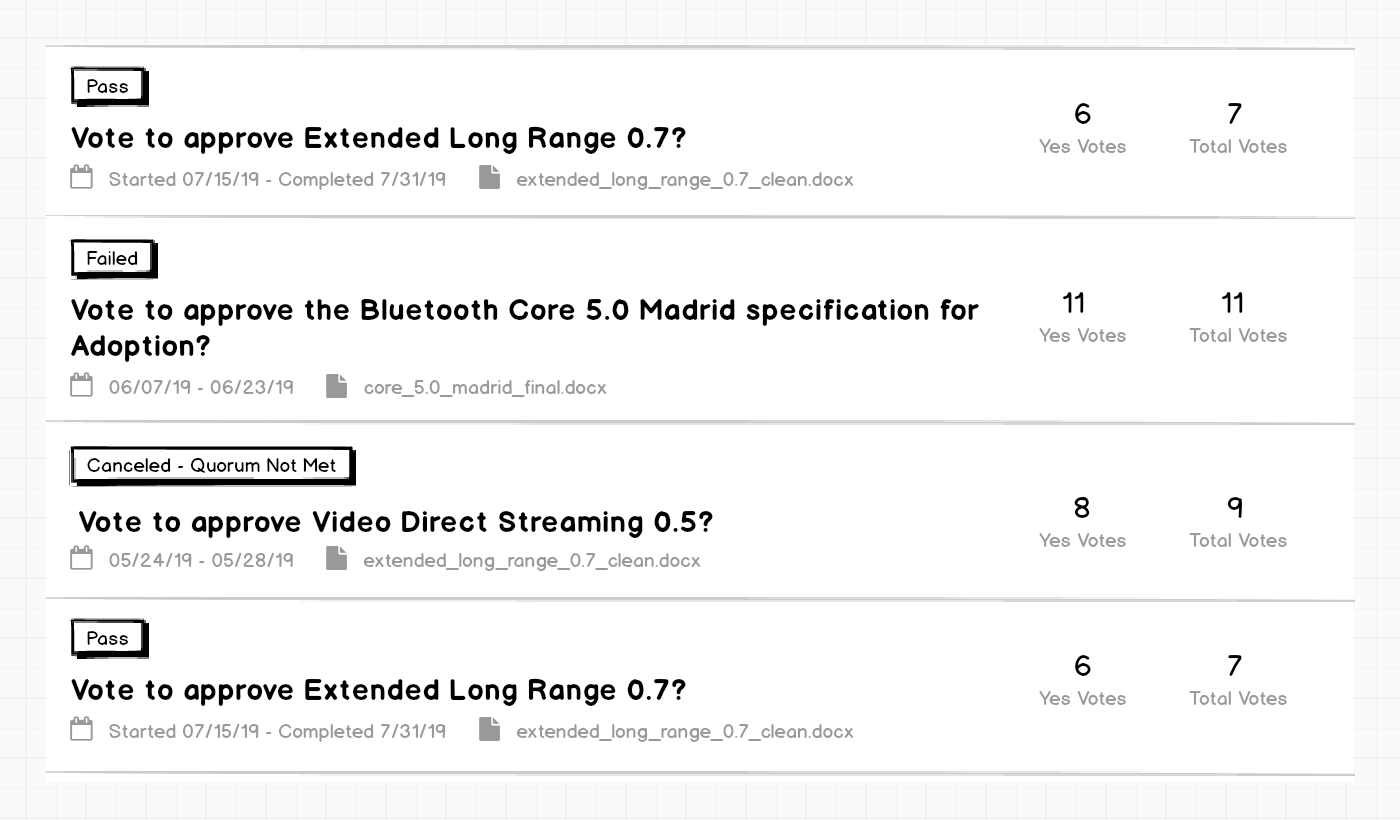
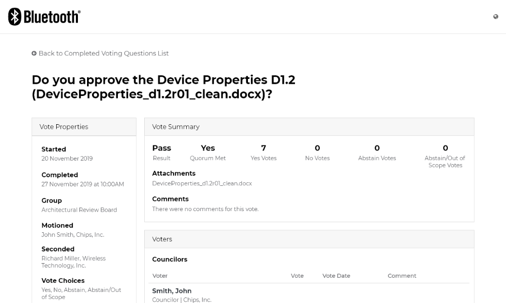
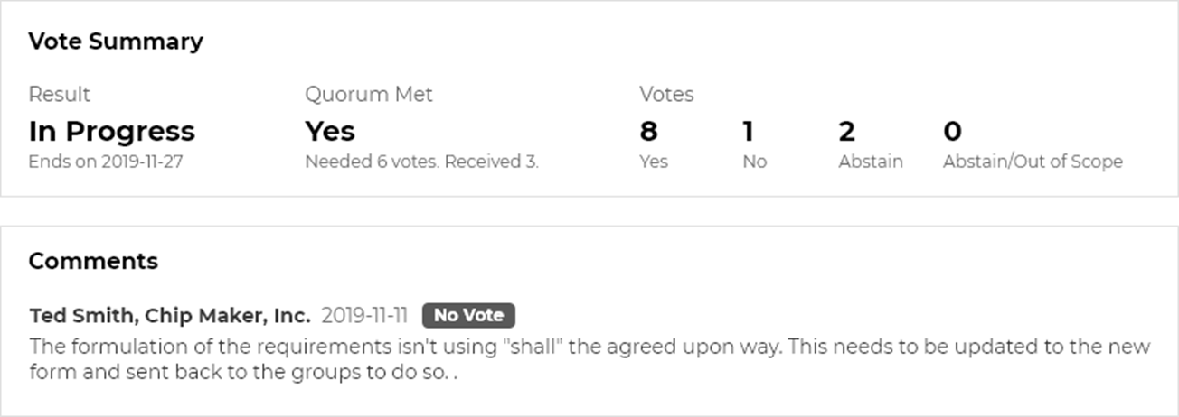
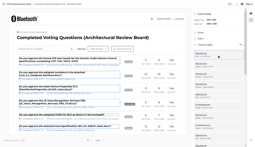
Based on our scenarios, it became clear we needed two views: a votes list, and a vote details page.
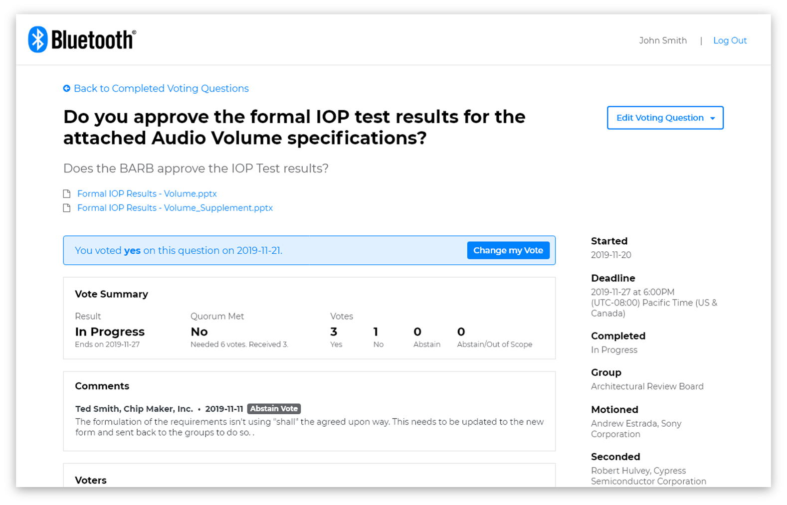
It also became clear that the vote details view needed a clear summary of the result of votes, which the current system lacked. This included the status, the count of votes, the document(s) being voted on, and any comments voters had for the group. This summary view would enable members to find the most relevant information quickly.
Low-Fidelity Wireframes
I started with sketches and then low-fidelity wireframes in Balsamiq to help conceptualize our scenarios as a tangible user interface.
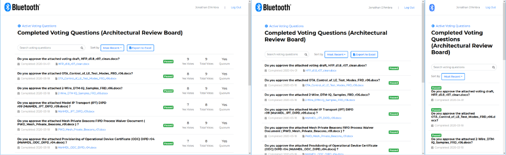
Tables, Cards, and Lists
One of the first questions we came upon for the vote list was whether to use a table, a list of cards, or a custom layout list to display votes. I mocked up our options on pen and paper, and then in Balsamiq:
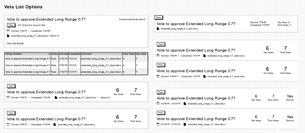
Given the length of voting questions and document names, we knew that a table layout would create scannability issues, as document names would be cutoff and the font need to be smaller. And while the visual design of cards seemed modern and trendy, their biggest advantage is in displaying standalone, discrete chunks of unrelated content. Given that the most common behavior of our members was scanning the data on the page to find the right voting question or document name, we settled on a list as our best choice.
Organizing Information
One of the major design goals was to create a summary view of a vote that gave members all of the key information about a vote in one place. I leveraged the prioritized, group postup of available voting data to plan what would be included in our summary:
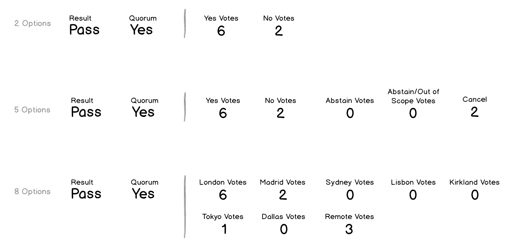
In addition, our existing system allowed members creating votes to customize the vote responses. There could be anywhere from 1 to 10 options to choose when casting a vote. Support for customizable vote responses. I looked at a number of options to support a dynamic layout of vote results:
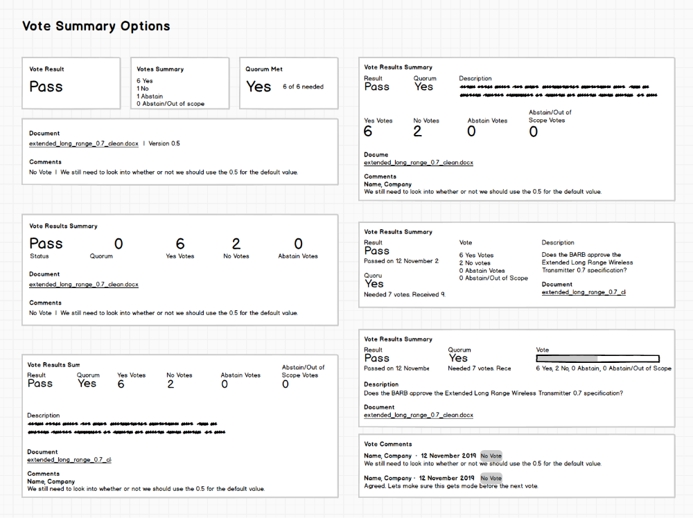
Ultimately, I settled on a simple column layout that wrapped as needed in the summary section.
It wasn't perfect - longer subtext strings would need to wrap as the browser scaled down - but it was functional. I was comfortable with the compromise knowing that we would have a chance to revise it as we finished moving the rest of the voting feature to the new system.
High-Fidelity Wireframes
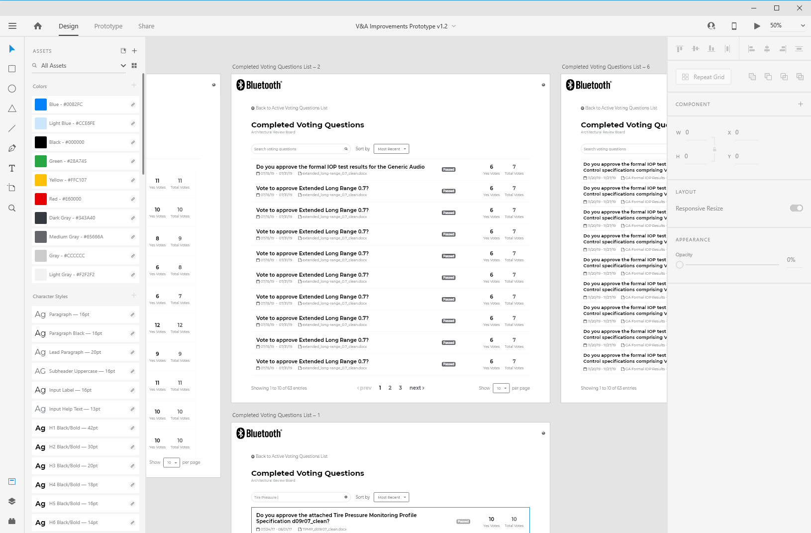
After completing the initial designs and reviewing with team, I moved into Adobe XD to leverage our UX Pattern library and to iterate on our designs.
Design Critiques
Prior to our first usability test, the designs were presented to the UX team during our standing weekly design critiques. As usual, the team had great feedback for me.
Re-Arrangement of the List Information
The team challenged the layout of the voting list items based on how I described the priority of the information, that members first task was to find the right question or document. I rearranged the list, moving the status to the right, to improve scannability of the question and document.
Additional Contextual Assistance
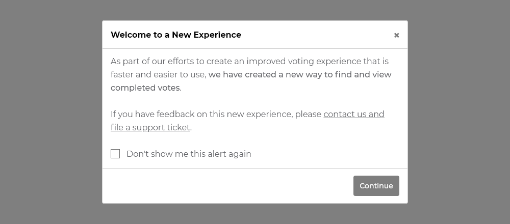
The team found the transition between the existing system and the new one to be challenging. They suggested the use of an intercept modal that appeared when viewing either system to ensure members were aware of changes.
Adjustments to the Details Page
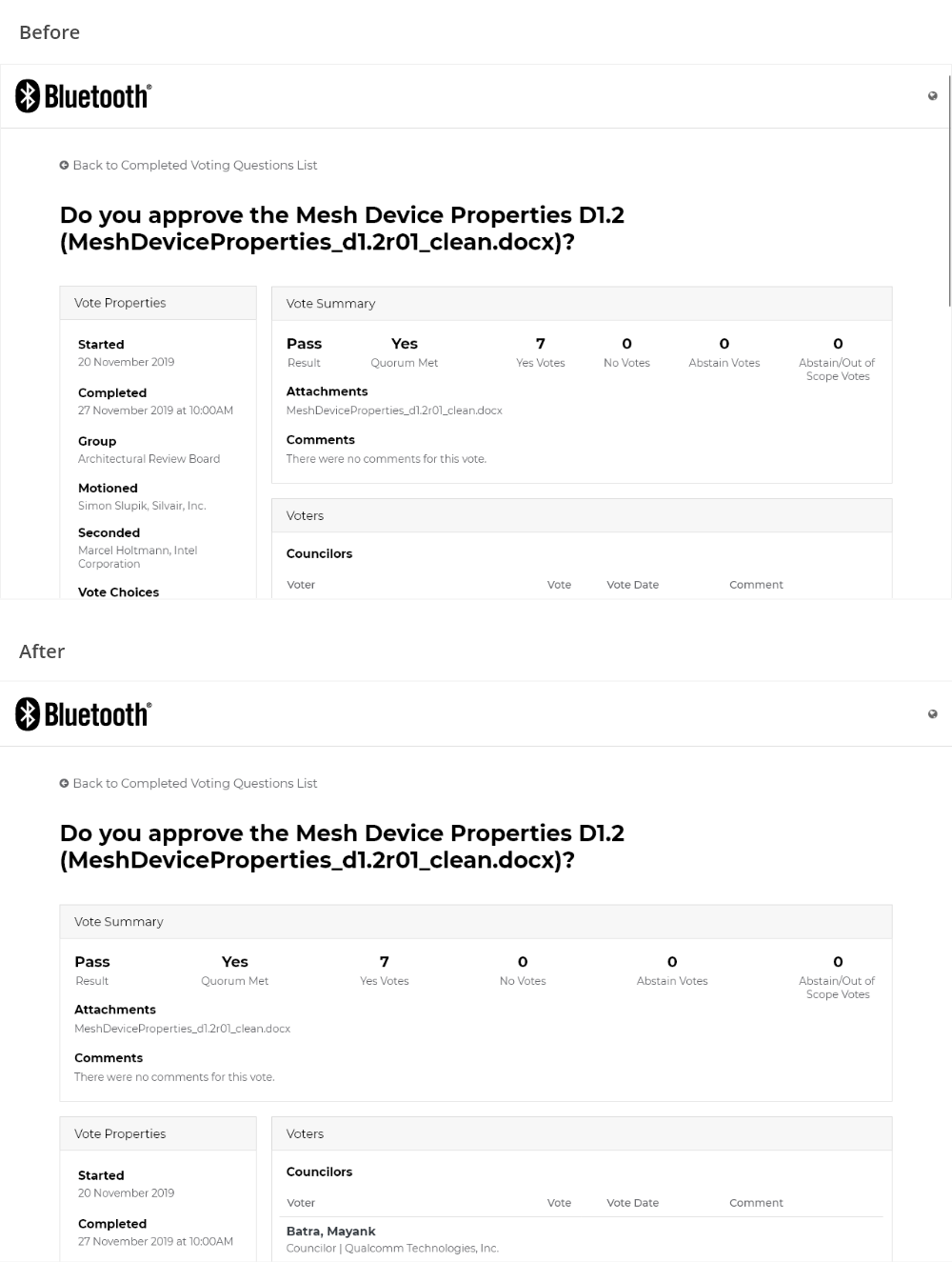
The team felt that the summary lost emphasis with the sidebar being positioned next to it. I moved the sidebar below the summary to help give it more priority and weight.
I cannot overstate how much value I get from the design critique process. As designers, it can be easy to get so close to the solution that your thinking can get fuzzy. Critiques like this one help me to step back and see solutions with fresh eyes.
Usability Testing
We conducted usability tests with 6 participants using a clickable prototype.
Our goal was to test members ability to complete key tasks, the discoverability of information, and the impact of our decision to use split workflows between the existing system and the new system.
We identified a number of usability issues and used the rainbow spreadsheet created by Tomer Sharon to capture them. Then, we prioritized them by severity of impact and the likelihood of members encountering them.
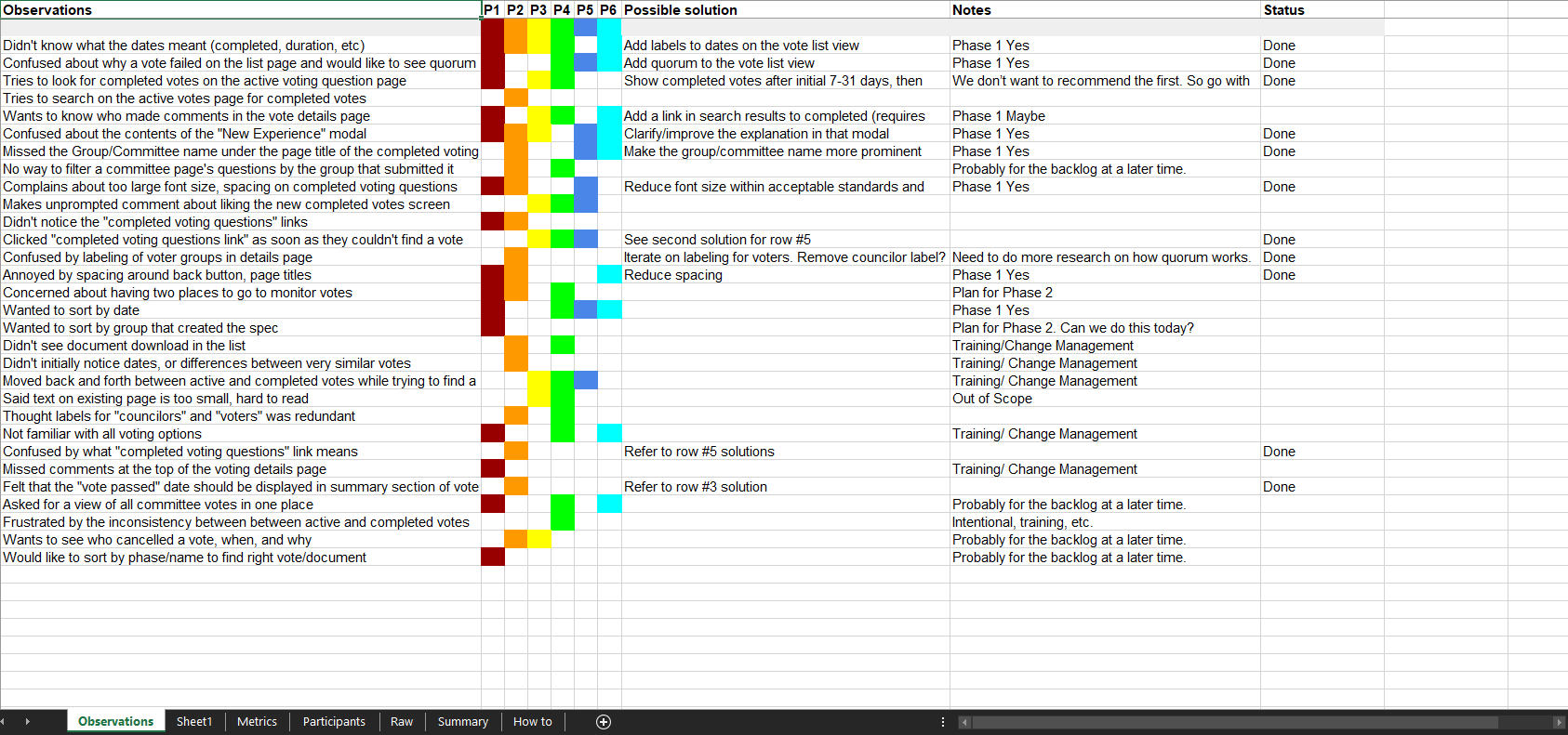
Based on our criteria, we decided to address the following issues:
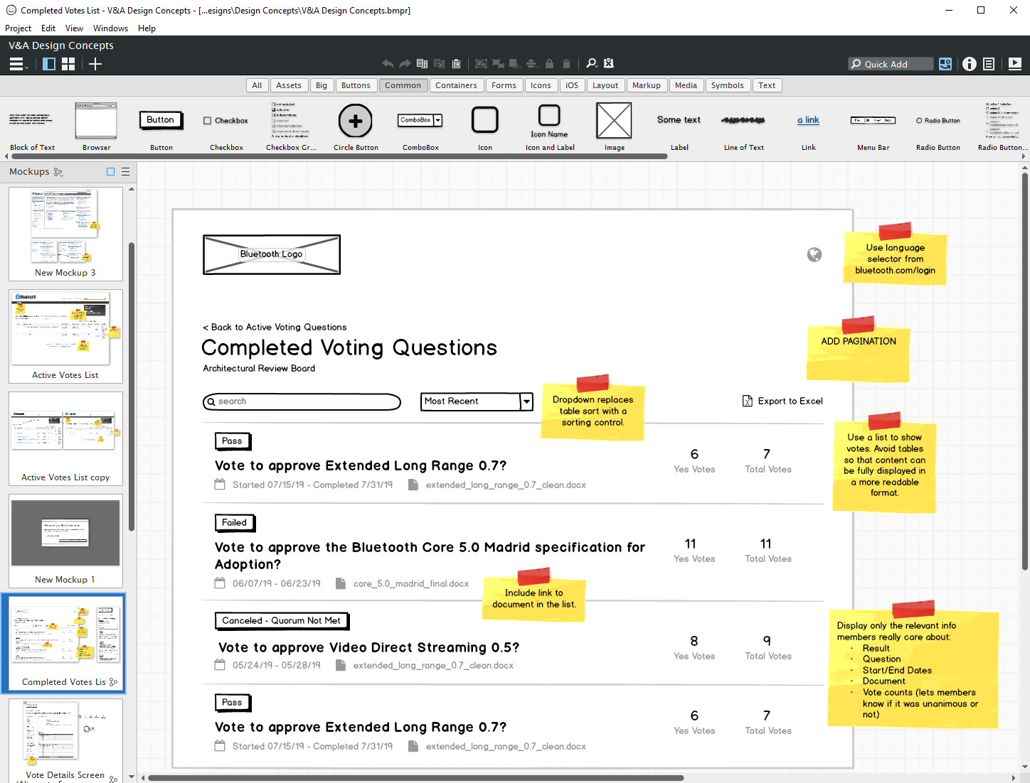
Vote List Adjustments
- Users found the way the list indicated multiple documents had been attached to the vote confusing. After a whiteboard session and a dozen iterations, we replaced it with a link to the first document and a label stating how many additional attachments were present.
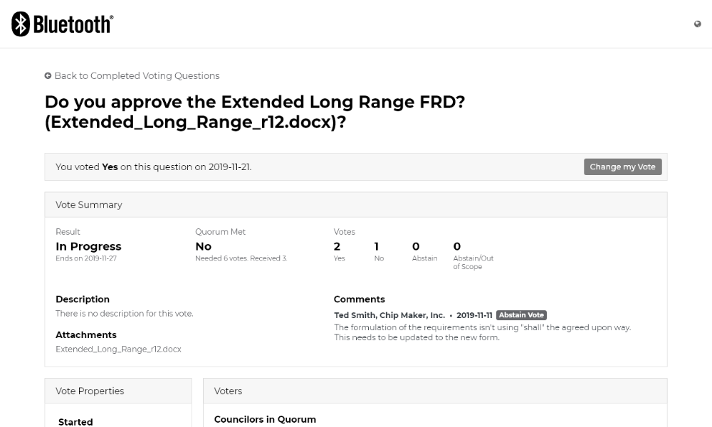
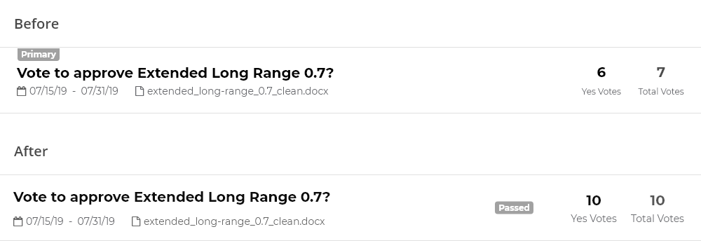
- Members struggled to identify what the dates mean in the date range, which was designed to show the start and end date of the vote. We simplified it, keeping only the most important date (Completed) and adding a label.
- Votes can often fail because too few members participate, which the voting process calls "quorum". Members wanted to understand why a vote failed right from the list, so we added an indicator of whether quorum was met.
- Several members complained that the UI was scaled too large for laptop screens, so we scaled down our font and padding sizes.
Voters List Adjustments
- In the old system, all possible voters were displayed in the voters list, even if they hadn't [participated. This wasn't ideal, as some groups have more than 700 members. We got feedback that showing these extra voters wasn't important, so we decided to show only voters that participated.
- We had previously made the decision to display any comments on votes in the Vote Summary section. Given the limited space we had to show a comment in the voters list, and based on member feedback, we decided to remove the comment column.
Vote Summary Redesign
Feedback showed the Vote Summary area was too complex. To address this, I:
- separated attachments and comments out into their own areas on the page,
- utilized grouping to created three distinct areas in the summary to improve scannability,
- and added additional metadata to each area to help add clarity.
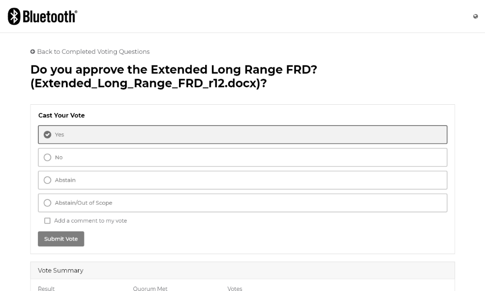
Vote Form
Our voting form was updated to fit seamlessly into the page with the new Vote Summary section.

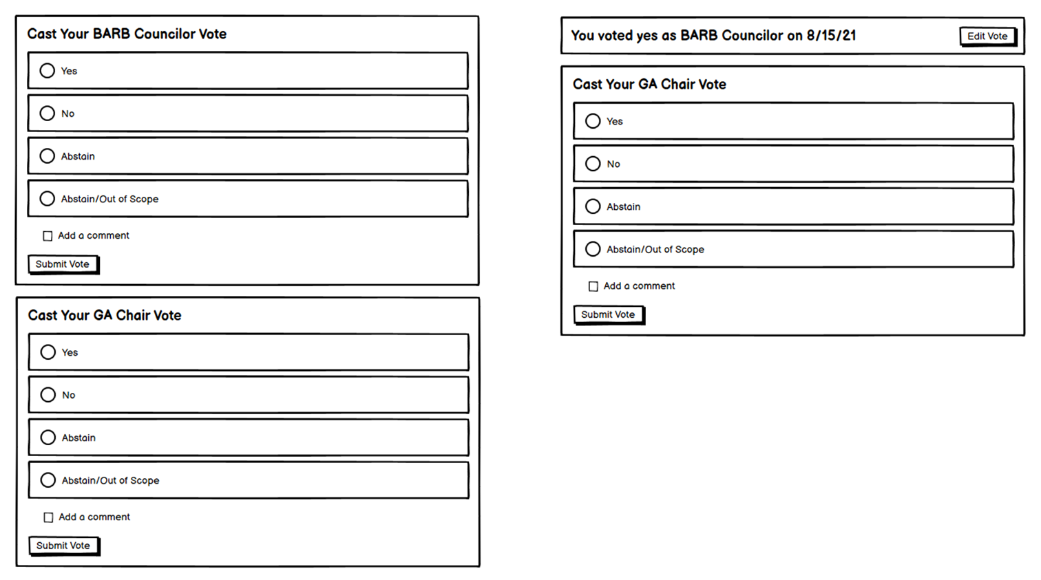
We also uncovered a new scenario we needed to account for: proxy voting.
Proxy voting enabled a voting-eligible member that wouldn't be able to participate in a vote (if they were, for example, on vacation) to designate someone else to vote in their place. This meant we needed to allow designated proxy voters to vote more than once.
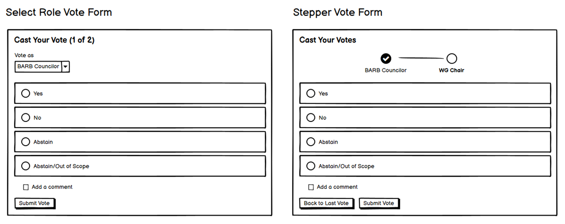
We explored a number of options, but ultimately settled on showing multiple, clearly labeled vote forms.
Preparing for Implementation
At the Bluetooth SIG, one of our employee values is communication, that (insert summary of it here). And given that our strategy was essentially series of mini-waterfall projects, much reliance was placed on the design documentation to clearly communicate our design intent with our engineering team.
I used Adobe XD to frame our designs with annotations and explanations at every step in the workflow:
To help with the visual styling and details, I encouraged our UX engineer and our engineering teams to leverage Adobe XD's specs view. Between that and our UX pattern library, the teams had almost everything they needed, I avoided slowing the project to produce detailed specs with redlines.
Finally, as the engineering team began active development, I collaborated with our UX engineer on responsive behaviors at small and mobile screen sizes, which we plan for all features in the product. Rather than invest the time in documentation, the UX engineer and I met for 20 minutes to discuss the desired behaviors. This included hiding non-essential information in the votes list view that was available on the vote details page in exchange for a more compact, scannable list.
After investing another 30 minutes chatting over the course of the UX engineer's several hours of iterating on the implementation, we arrived at great responsive layouts for very little cost.
Validation
We solicited member feedback one last time before launch to help us prepare for any feedback we might get after release. We also wanted additional data to inform our next project.
A couple of weeks before launch, we conducted 1:1 interviews with 5 members and asked them to walk through the new experience in a beta environment. While there was some constructive feedback, the reaction was mostly positive:
Potential Issues
- Splitting the voting experience across two tools was initially confusing
- Members were concerned that they couldn't see or search for votes all in one place
Potential Wins
- Members were very satisfied with the new experience, especially for tasks like quickly finding and downloading documents that were voted on
- Members were able to easily navigate between the two systems after initial confusion
- Speed was vastly improved, and members were thrilled
Launch
We launched the new voting experience shortly after a member event, during a time the tools would experience slightly higher than average traffic.
The deployment was quick; disruptions lasted 2-3 minutes, and we immediately started to hear feedback through our change management channels:
I like the new design of the Completed Voting Questions page with the options to sort and export which I find useful to surface historical dates to update the specifications in Workfront.
- Anonymous Member
I think this is a good improvement. The clarity of who voted and what the comments were is great. Also, the previous search was odd: it was like a filter and was too limited. The new one is a proper search and searches on more terms.
- Anonymous Member
Just wanted to pass on the feedback of well done and nice work to the responsible team.
- Anonymous Member
The new voting tool is much faster, and its much easier to find the documents being voted on. Nice work! I hope to see more improvements soon.
- Anonymous Member
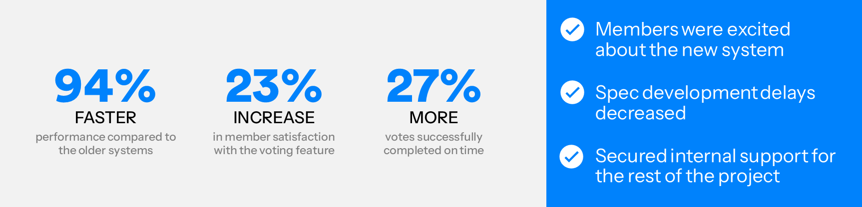
In addition, we were thrilled to achieve our business objectives around performance and adoption:
What's Next
Originally, the team planned to continue releasing slices of our new experience over time.
Since I left the Bluetooth SIG, new leadership has changed strategies, and several parts of this planned experience are being replaced with commercial, off the shelf tools.
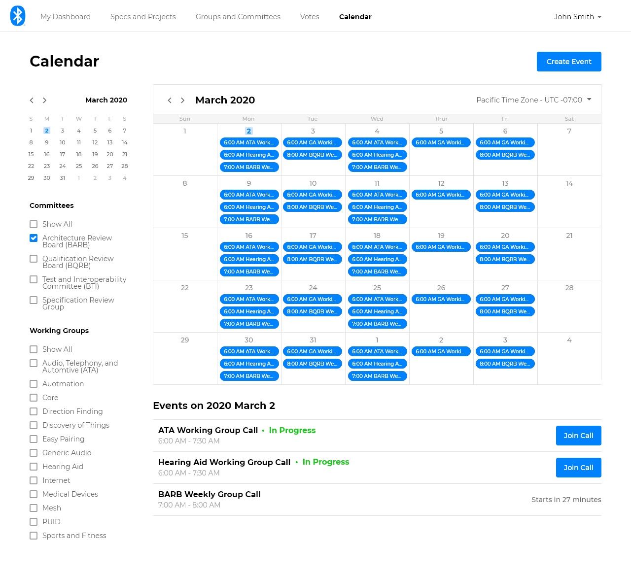
However, this work continues to inform the team, and a few more pieces of the experience were being built, including:
- Groups and Committees
- Calendar
Learnings
Don't Let Scope Grow Too Large
When it comes to replacing large, complex legacy systems, it's not uncommon for stakeholders and even designers to jump straight to the big, magical redesign. This kind of thinking comes can be akin to "biting off more than you can chew".
In our case, the big redesign as we originally conceived it would have taken years to even see a first release, That knowledge made it all to easy for other priorities to creep in and take resources and time away from moving this larger, and more important project, forwards. We let ourselves get stuck in the swamp of trying to steer stakeholders into making large, expensive, and costly choices to get to our end goals.
By pivoting our strategy to strangling out this legacy system, we allowed ourselves to think smaller and faster, and we allowed our stakeholders to make decisions with more certainty and less risk. While this can come with sacrifices, like our initial fractured voting experience, those tradeoffs can be managed over time, especially if it means delivering a lot of value to the users and the business in exchange.
Research Matters
It's a common struggle in UX to justify the budget and time to do proper, thorough user research. We were fortunate in this effort to have both. As a result, we had the user data to answer most prioritization and design questions even in the face of changing product, development, and release strategies. When we didn't, we were able to make educated guesses.
Time and again, my own experiences continue to show that the real value of user-centered design is in promoting understand and empathy for users' goals, needs, and behaviors.