When is Everyone?
Designing a mobile app that takes the stress out of getting together with friends.
The Problem
Let's say you've just arrived at the restaurant you and your friends picked out for lunch. You walk in the door, take a quick look for your friends, and realize no one else is there. Where is everyone?
You planned this a couple weeks ago; hopefully everyone is still coming. Should you go ahead and grab a table? Maybe you should you start calling and texting friends to check in?
You could do that, but its time-consuming, requiring you to juggle half a dozen messaging apps while you awkwardly stand next to the hostess.
The inability to quickly find out if and when your friends are coming may sound like one of life's smaller problems, but its one of those everyday things that creates anxiety and takes the fun out of getting together. Worse, it often discourages people from getting together at all.
The Goal
I partnered with the founders of Woh! to create a mobile app that makes getting together with friends easier.
We were a small team: a Product Director, iOS developer, web services developer, and a designer (that's me!) with full-time jobs, so we ruthlessly pursued an achievable, minimum viable product to ensure we could release it in a timely manner.
The Action
We started with some discovery research and conducted user interviews and concept design reviews. We workshopped some initial ideas on the whiteboard, building out the skeleton of our user flow.
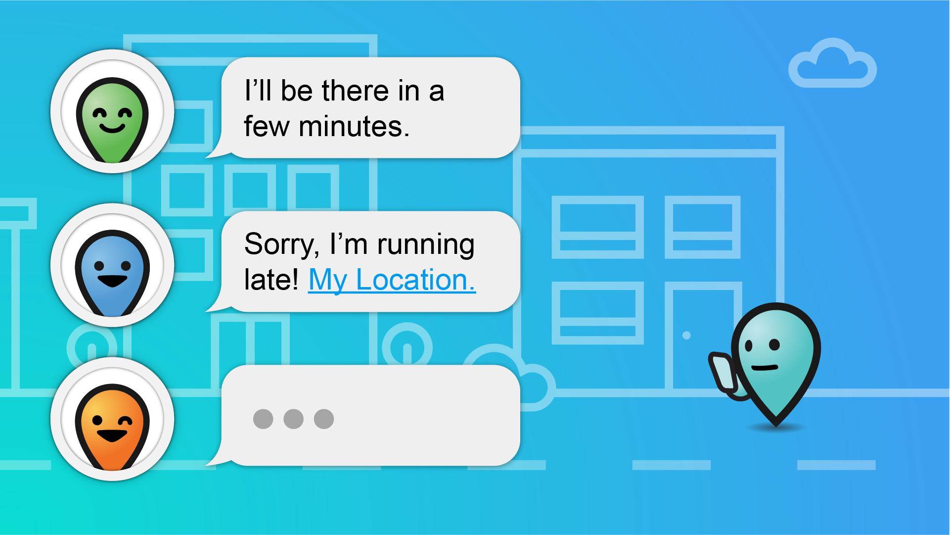
Early on, we discussed competitors use of maps and GPS locations as a possible feature. However, our discovery research gave us a key insight into what could resolve the social anxiety we were trying to address: people didn't really need to know where someone was, they just wanted to know that they were coming and how far away they were.
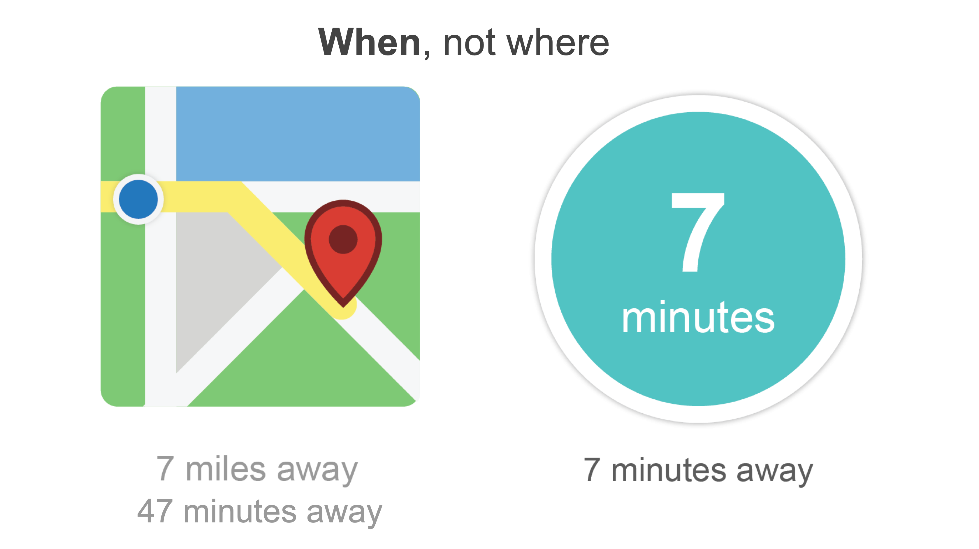
That key learning became the cornerstone of our app design (and our unofficial motto, When Your Friends Are). To leverage our findings, our MVP was made up of a few key features:
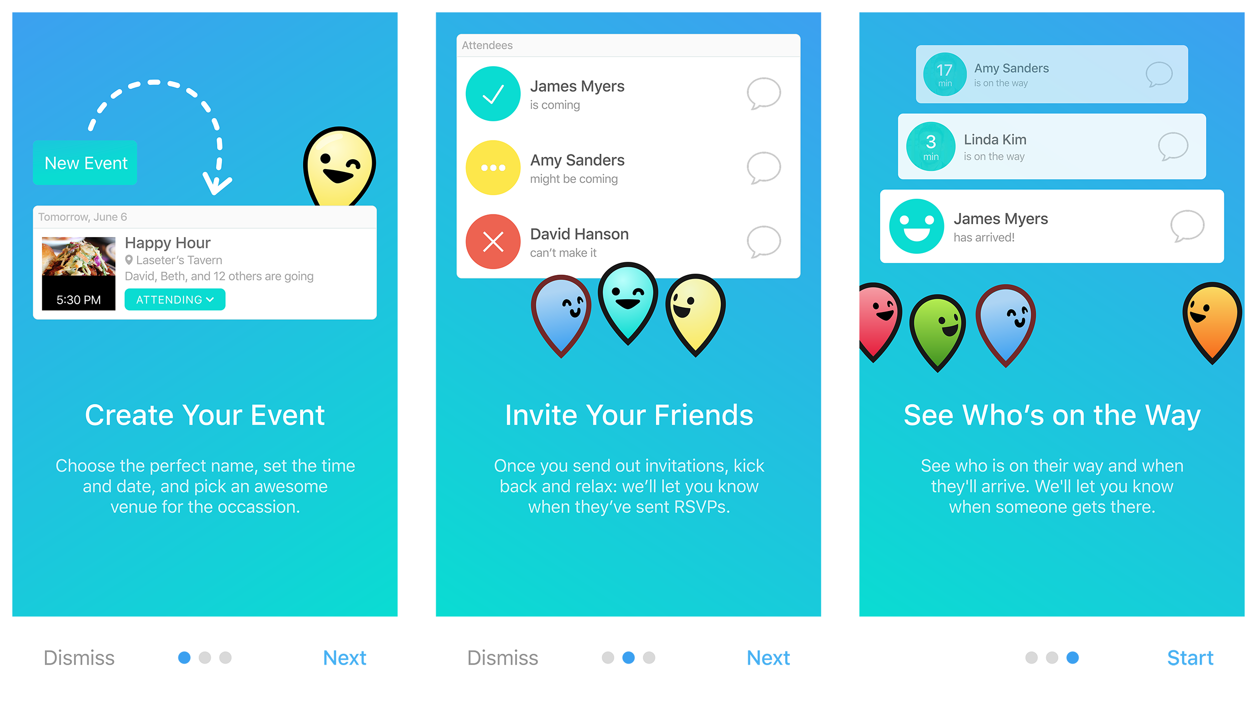
- The ability to create events and invite people to them
- Enabling people to accept or decline event invitations
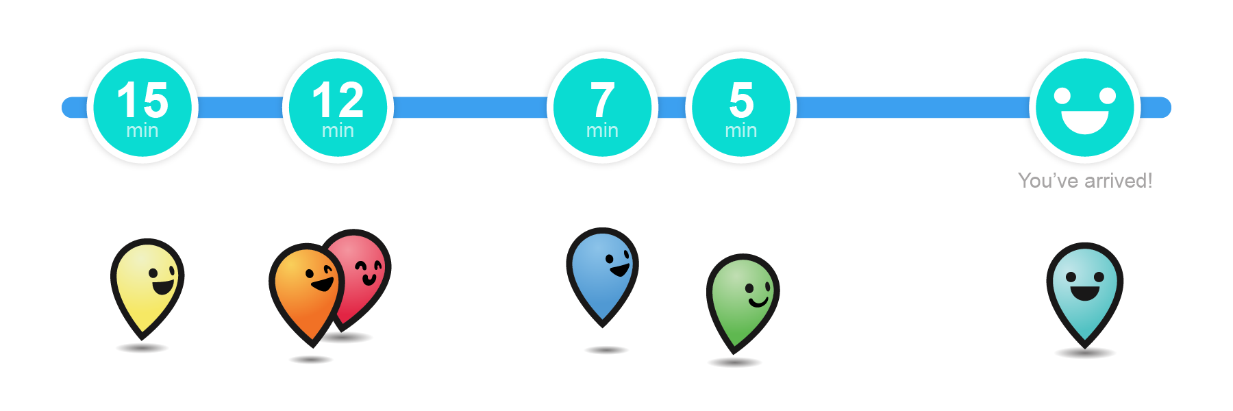
- Showing each user's estimated time of arrival to the meetup location shortly before the event began
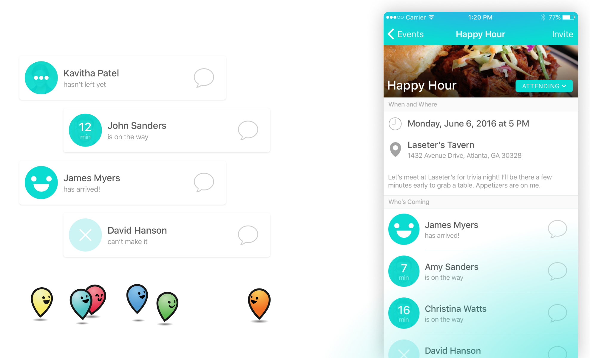
I blocked out a simple and easy to develop interface the focused on events, invitations, and ETAs. We had three main views:
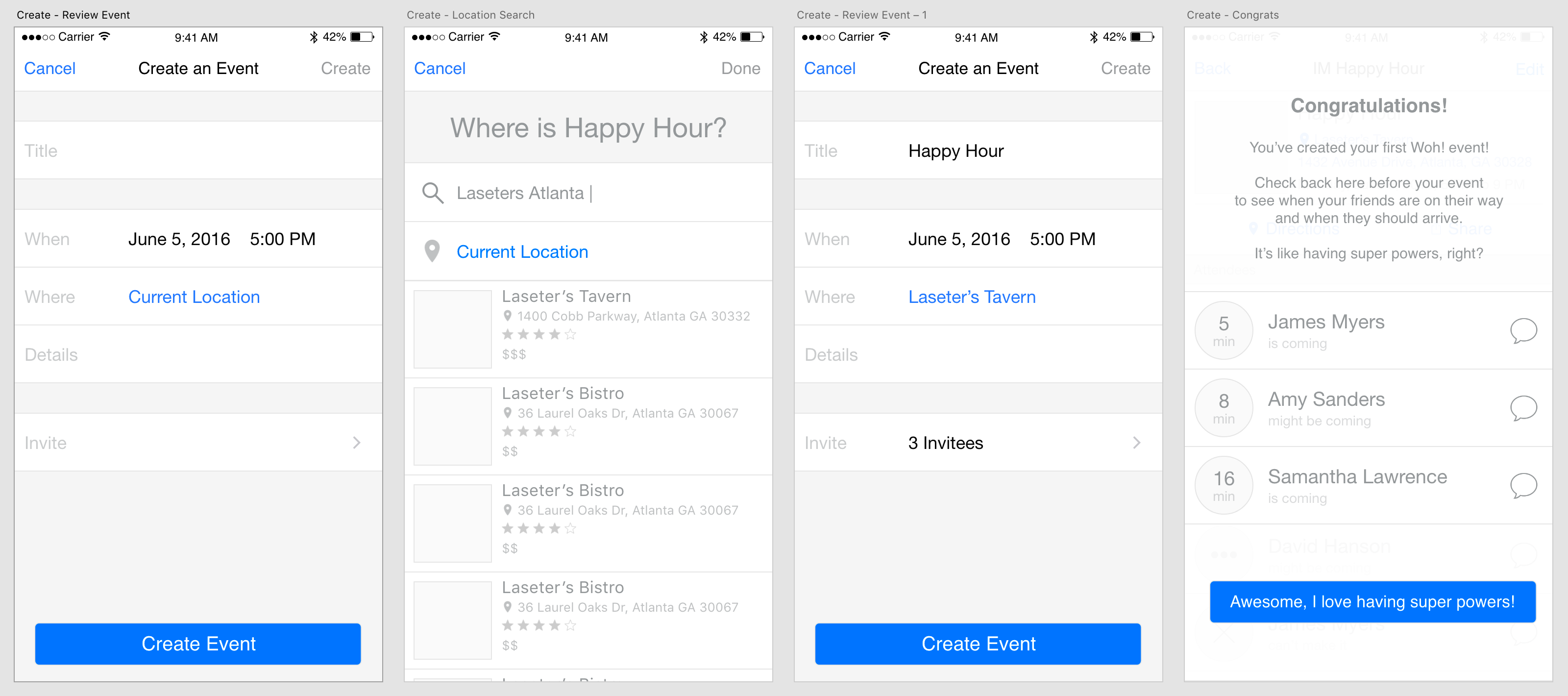
Creating an Event
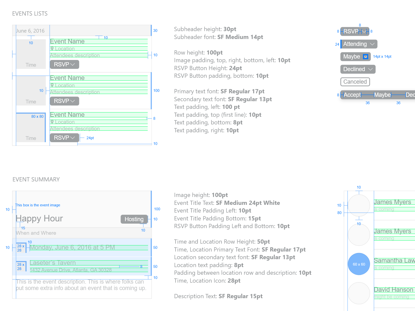
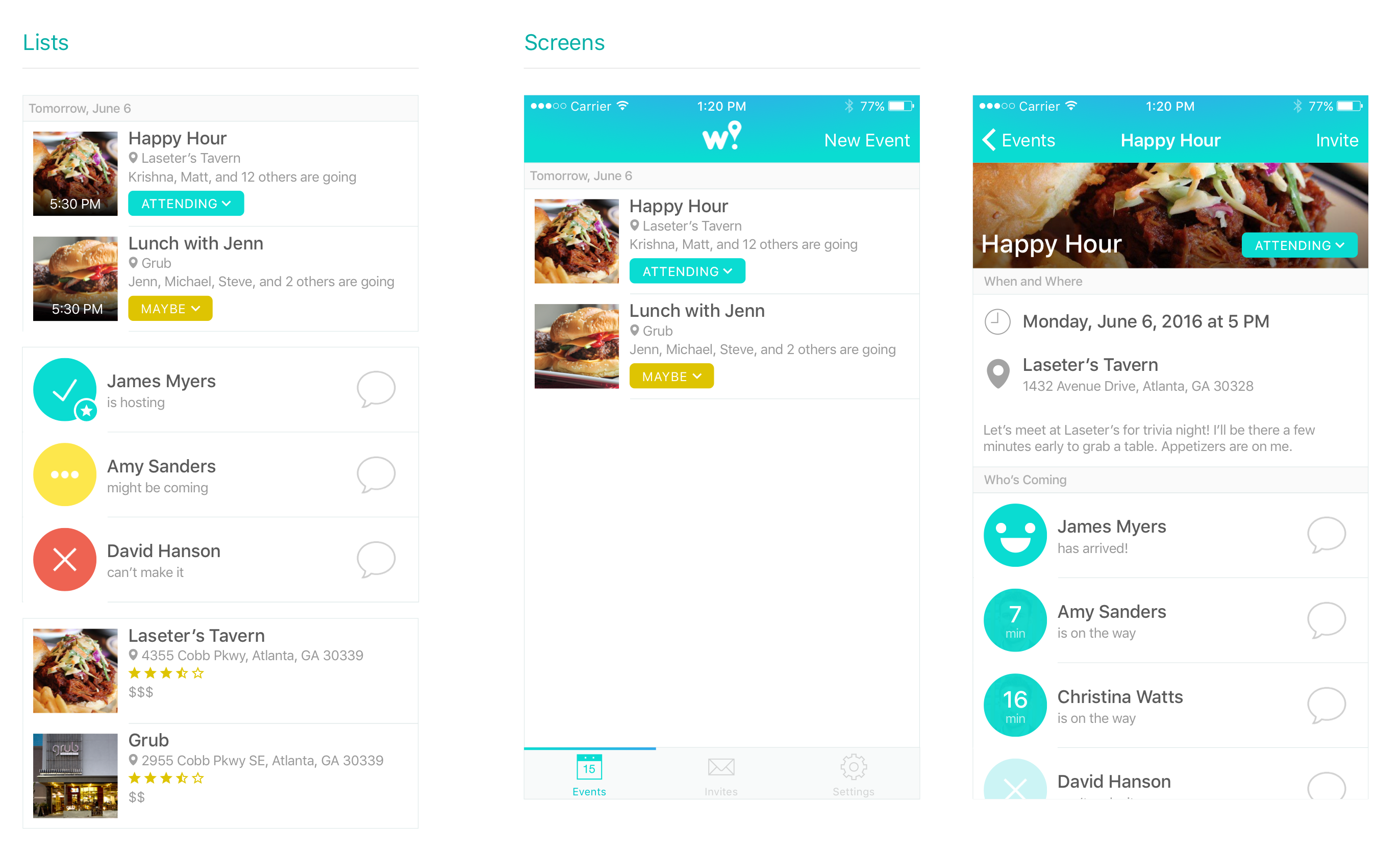
Based on our own personal experience and from our user interviews, we knew that people wouldn't use an app like this unless it was lightning-fast to use. So we focused on making event creation simple. You set a name, a location, a date and time, invite some friends, and optionally add some notes. Our tests shows it would take the average user under 30 seconds to create a typical event for a meal with friends.
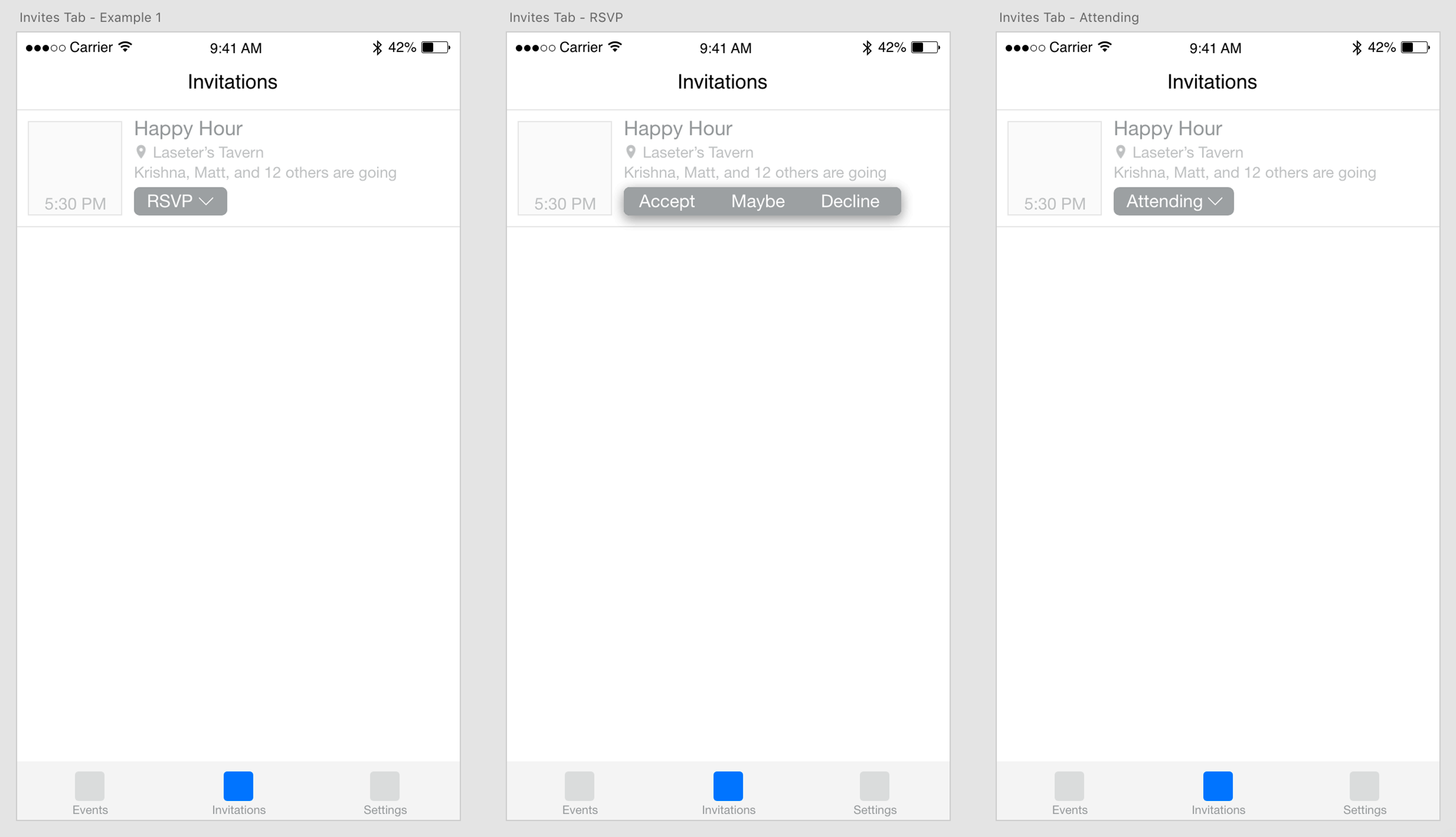
RSVPs
The main objective of the events list was to make responding to invitations easy. We defined a quick RSVP mechanism that could be managed right from the list page.
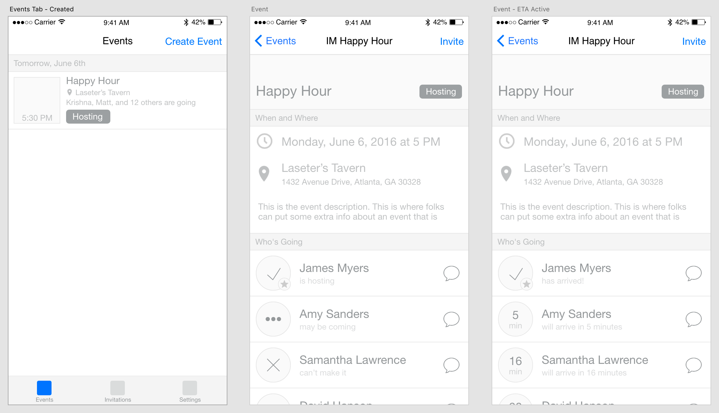
Monitoring ETAs on the Events Page
With the events page, we wanted the highlight to be the list of attendees. Prior to the event, this list serves as an RSVP tracking page. Anyone invited to it can come in and see who is planning to attend. 30 minutes before the event starts, we change the list and begin tracking the ETA of anyone planning to attend the event. This list updates in real time and bases the ETA time off of a geo-fence that surrounds the planned location. Once someone enters the geo-fence, they've officially arrived!
We created a simple prototype that we used conduct tests with friends and family to refine the experience.
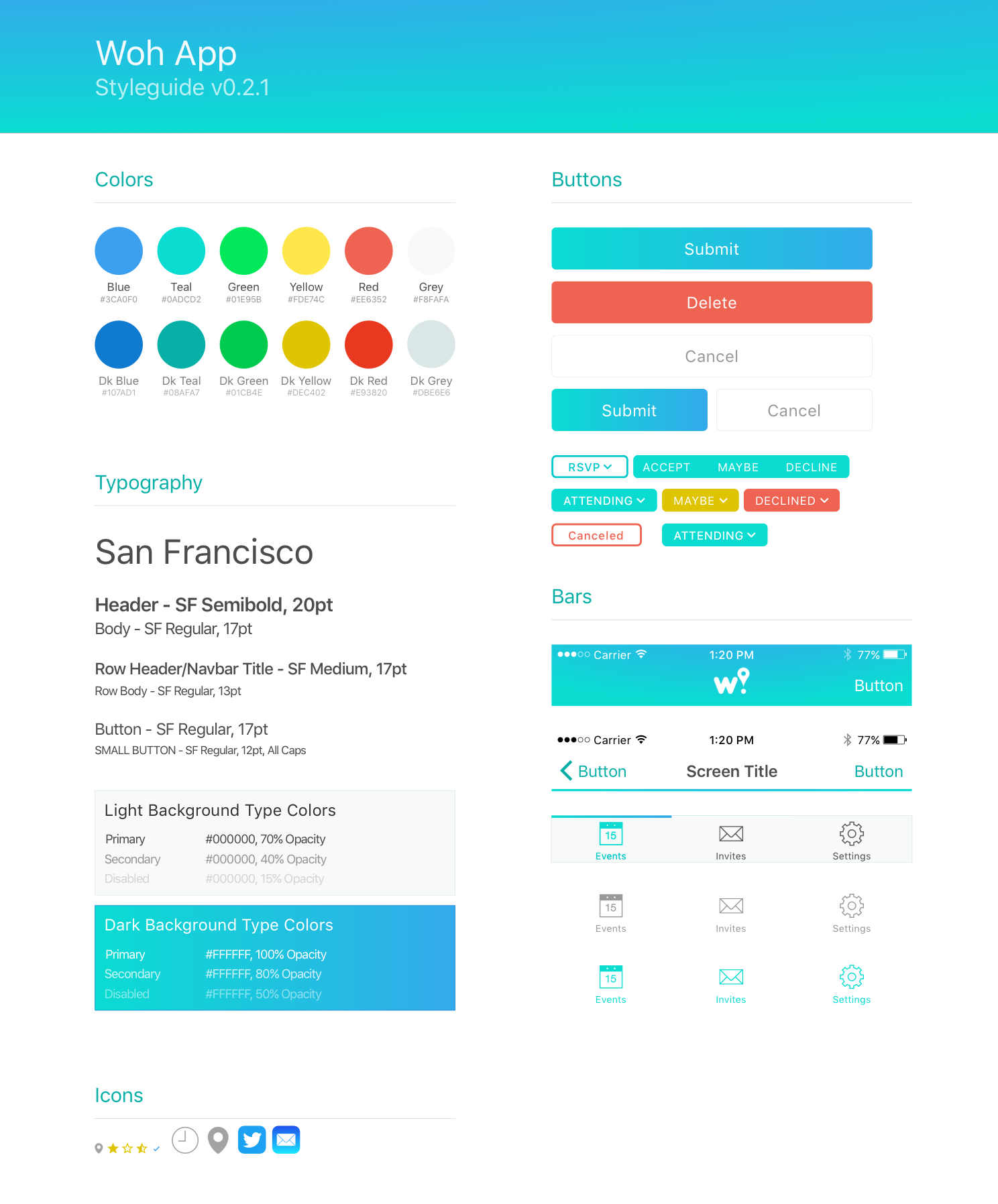
With the design blocked out, I began exploring a brand identity that would be fun, friendly, and iconic. I started by defining typography, a bright color palette, and the basic components of the UI. I also completed some redline specifications to help our developer work faster
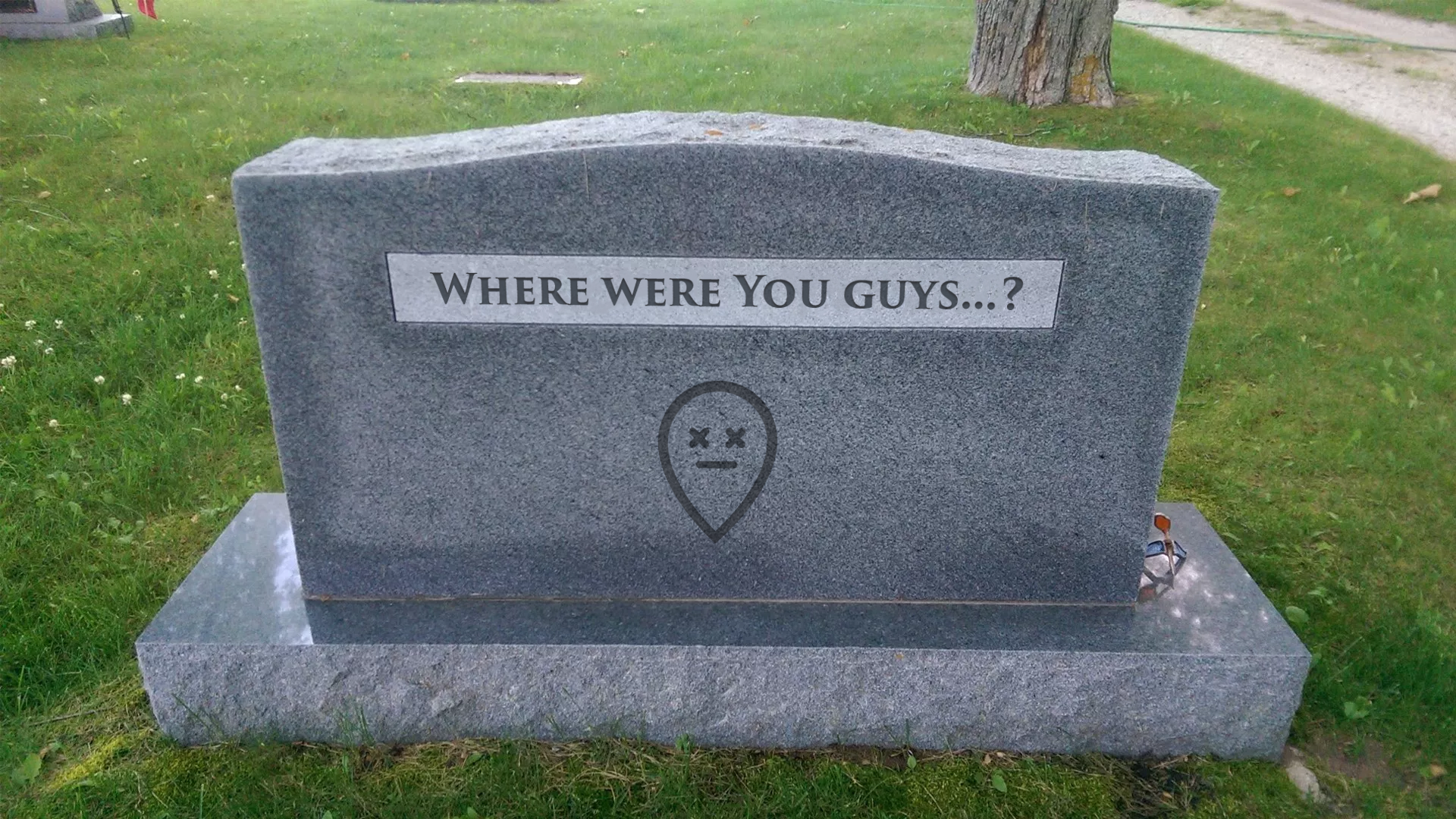
Then, I capped it all off with a set of figures designed to represent togetherness that we call "pinions". These pinions, which play off the map pin concept, represent the notion of gathering together. They're also a really fun way to tell stories and to express our brand identity.
Next, I applied our branding to our designs and the app began to take shape.
The Results
The app was released and the team collected lots of great feedback from early users. I also assisted the team in preparing for several presentations to audiences at Switchyards, a start-up hub located in Atlanta, GA.
I also designed and released a single page website to help market the application.
The app had lots of positive feedback from those presentations. The team hoped to continue working and enhancing the app in the future.
Epilogue
Since the Woh! app was launched, the small team behind it got busier, moved cross-country, and had less and less time to dedicate to nurturing it's growth. Rather than allow the app to continue along without adequate support or improvements, we shut it down and removed it from the app store.
While Woh! didn't have the life span we originally imagined, it was an incredible collaborative experience that taught us a lot about product vision and strategy, marketing, sales, design, and most importantly, supporting users with great experiences.