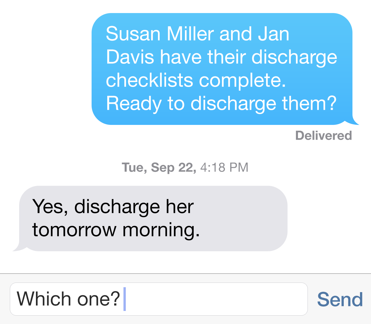
Wait, who are we talking about?
Summary
Worked to improve care accuracy and care coordination in a healthcare web and mobile application by designing an interaction that allowed care providers to link to patients in instant messages.
The Problem
Our instant messaging mobile application was targeted towards multidisciplinary care teams (an industry term for doctors, nurses, case managers and others that work in close-knit teams to coordinate patient care). When those care providers used instant messaging to talk specifically about patients, they sometimes had difficulty identifying which messages were about which patient.

These care providers either had to spend valuable time clarifying which message was about which patient or, if they couldn't reach the message sender, they had to make their best guess. These inefficiencies ate up valuable time and increased the risk of medical errors.
The Goal
We wanted to make it easier for providers to know what patient they were chatting about.
The Action
After hearing multiple reports of this problem, we got a team together to plan our next steps. We decided to:
- Interview users and subject matter experts (SMEs) who had experienced this problem
- Analyze competing applications to see if and how they addressed this issue
- Engage subject matter experts in collaborative design sessions
Our interviews revealed new issues that we might have otherwise missed: not only was it sometimes hard to tell which patient was being discussed, but users weren't always familiar with a patient. And because our application had no easy way to access the patient's information from a conversation, our providers often stopped using their app and went to find whatever paper documentation was available instead.
With a better understanding of the problems our users were experiencing, we revised our goal: we wanted to make it easier for providers to know what patient they were chatting about and to access that patient's record right directly from the conversation.
Next, we completed our competitive analysis. we found the vast majority of solutions did one of two things to address patient-specific communication:
- Included patients as the subject of a chat thread
- Treated a patient as an email-like message or notification, not as an instant message conversation
With our interview report and competitive analyses in hand, we moved to our collaborative design sessions. The approach of setting a patient as a subject in a message thread seemed like a simple, easy approach and, as we walked into the meeting room, our team expected that it would be our solution.
However, a pivotal question came up in the midst of our discussion. As we reviewed user scenarios, I walked the team through a situation we had discussed in our user interviews.
"I'm a doctor and I'm handing off five patients to the next doctor coming on shift. I want to talk to him about each patient's details. To do this, I would need to start five conversations, all with the same doctor, but with five different subject lines. To keep our discussion on the right patient, I would have to switch chat threads with that doctor to the right patient subject every time we talked about a different patient. Is that something a busy doctor will do?"
The resounding answer from our SMEs was an emphatic no. They reminded us that our users were required to use more than a dozen different systems, and anything that made communicating more cumbersome and time consuming would become a reason to stop using the application. As one SME stated, "If the user is already talking with the person they want to talk with, why she switch conversations just to change a patient subject line?"
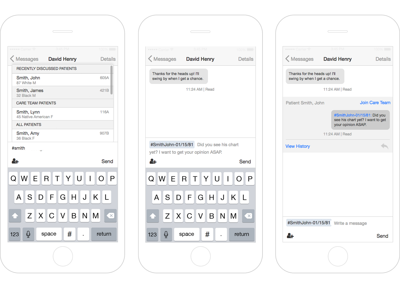
We decided a patient subject line would be too laborious to use, so we started brainstorming other concepts. To maximize the real and perceived ease of use, we focused on solutions that would allow users to talk about any number of patients in a single conversation. When the dry-erase marker dust settled, our team had a new approach that borrowed from social media. We would allow users to tag patients in a message and, when tapped, the patient's record would be displayed directly on top of the conversation.
With our SMEs in agreement, it was time to find out if it would work.

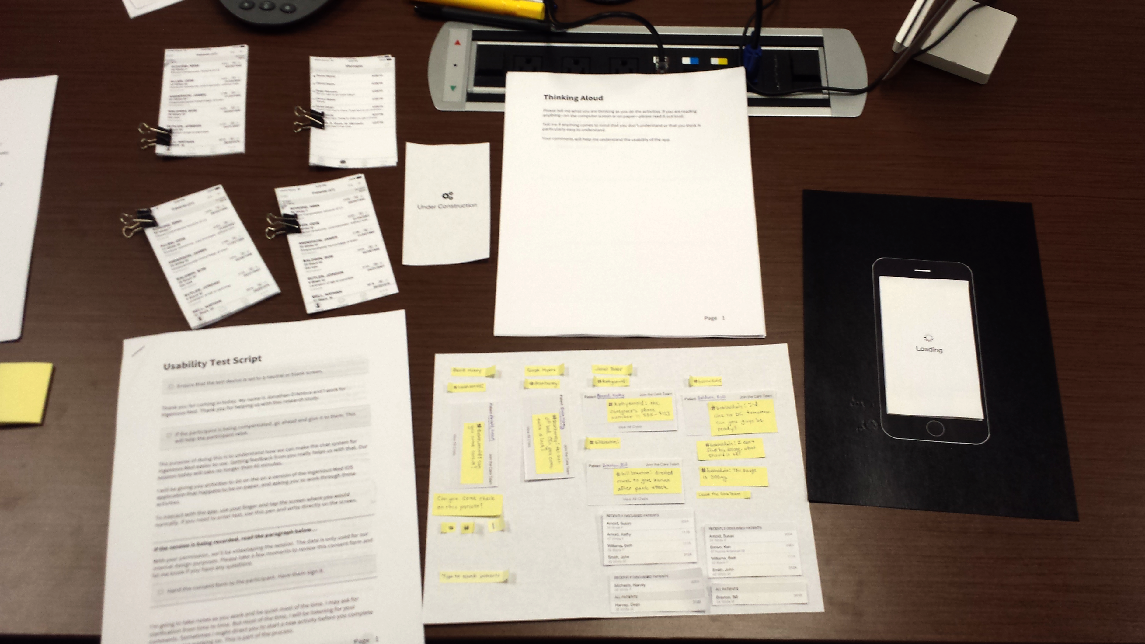
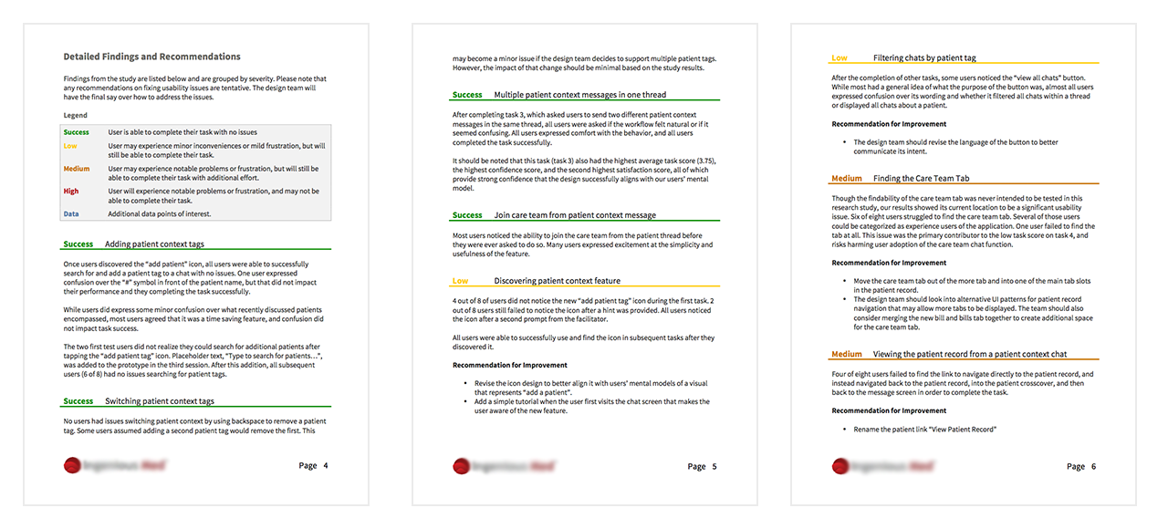
I constructed a paper prototype in a few hours and we tested the design with eight users the following day. We discovered a couple of major usability issues with the flow of the design, but the test results showed the overall concept of patient "tags" worked well. After another prototype iteration, the major usability issues had been addressed.

My Role
In this project, I was specifically responsible for:
- User and stakeholder Interviews and report
- Competitive analysis report
- Design session
- Tasks
- User scenarios
- User flows
- Sketches
- User testing (paper prototype) and report
- Wireframes (with interaction specifications)
The Results
After our final round of user testing, seven out of eight users completed our task successfully with either minor or no issues. We delivered a set of design specifications to the development team and are currently working with them on its implementation.
